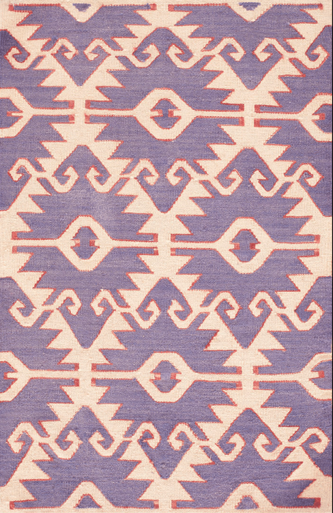
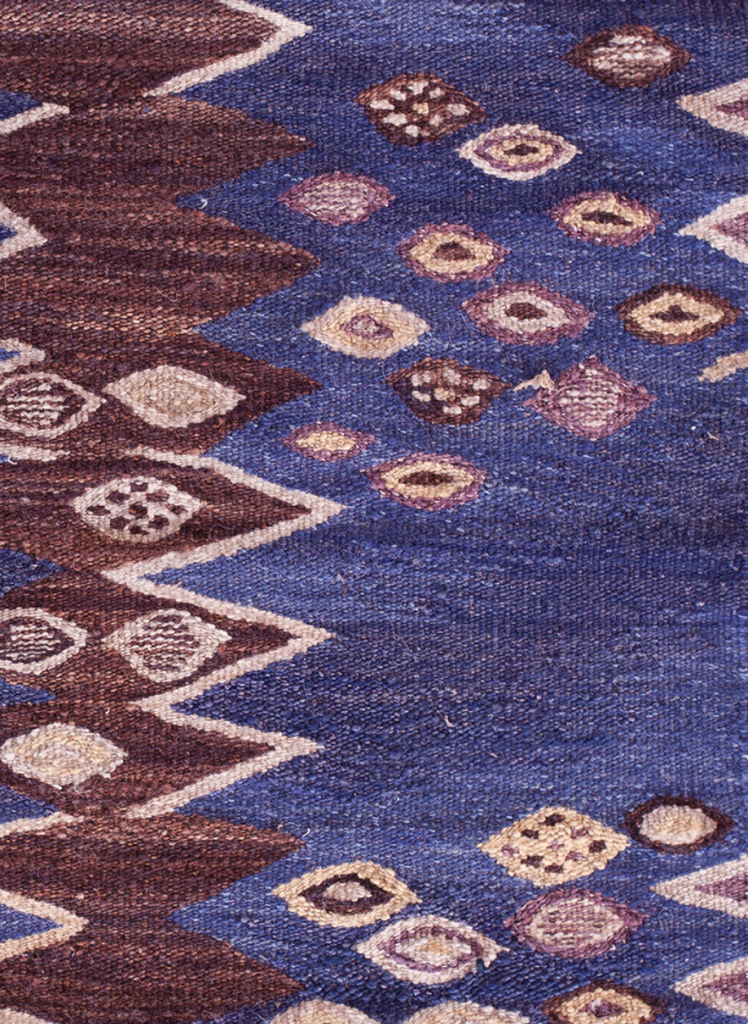
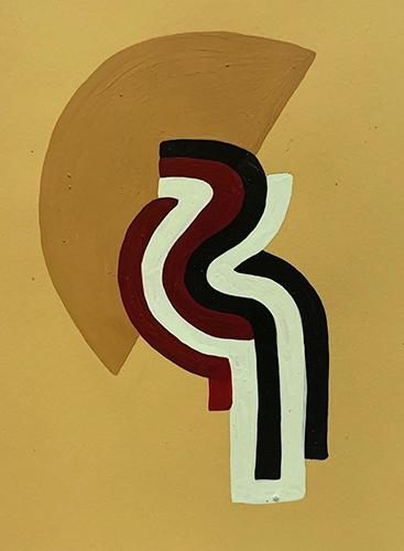
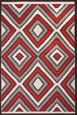
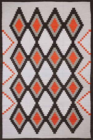
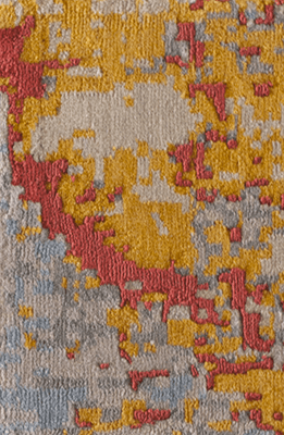
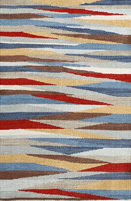
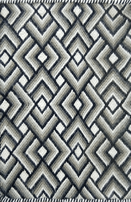
There's a strength that comes with the use of black and red - a sort of statement that says, "I'm here, and I'm ready".
In this bold yet airy entry way, designer Patrick Printy uses the graphic nature of black and red to draw the eye towards individual statement pieces. The colors of the Navajo rug play perfectly with the Asian art on the walls, creating a sort of tension through conversation.
The rigidity of the jagged edges of the design adds a sense of motion to this energetic layout - keeping the eye in constant motion.
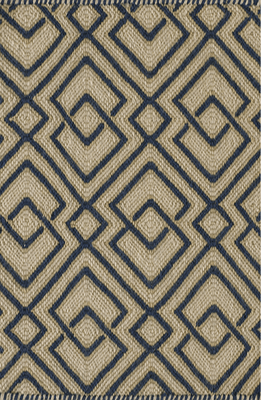
To view more from our Navajo - Four Corners collection, click here.
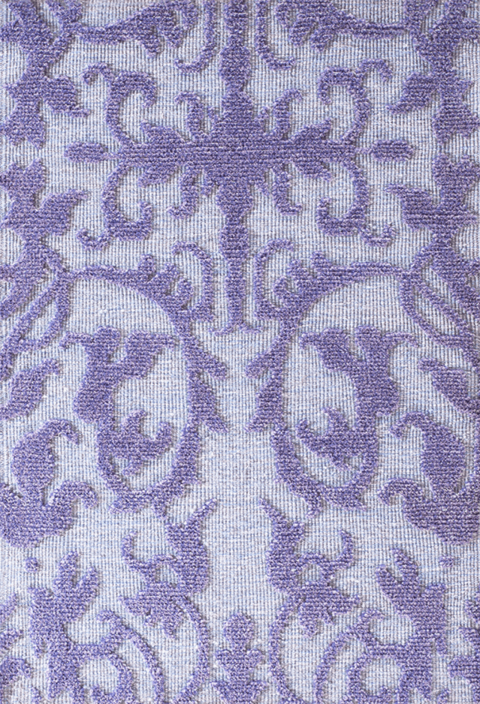
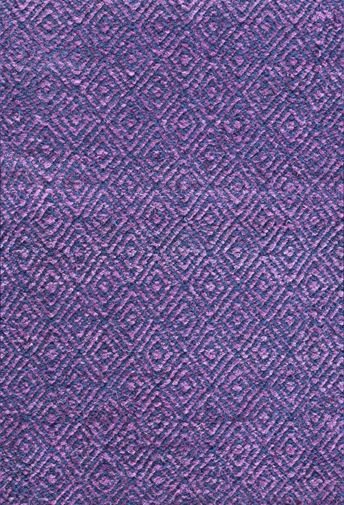
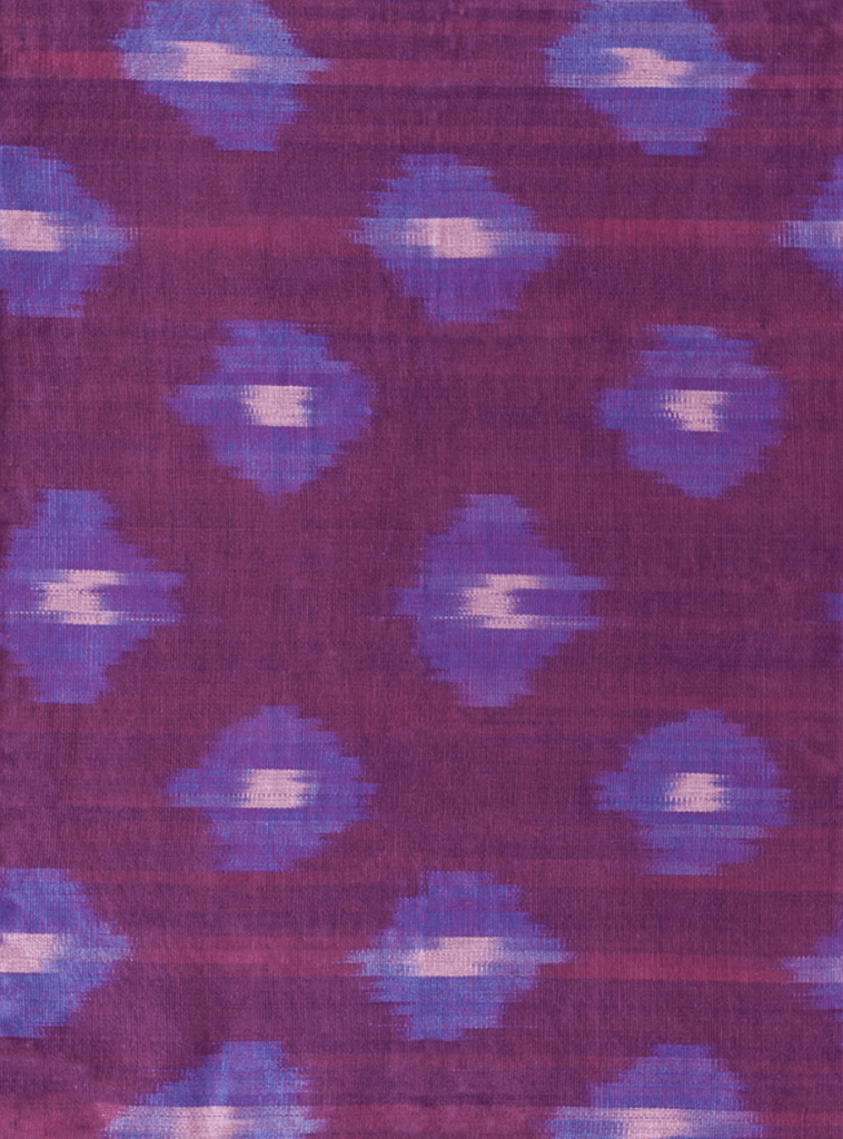
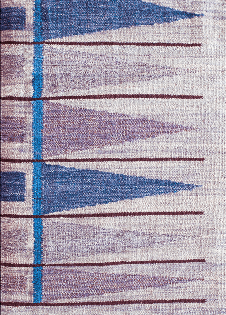
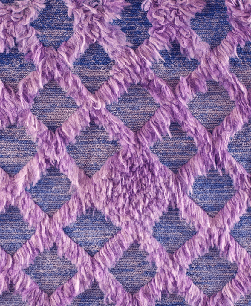
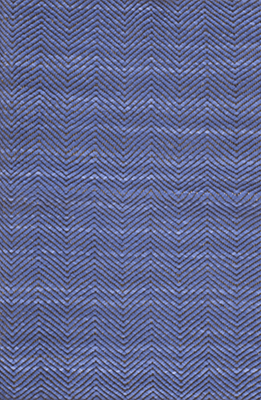
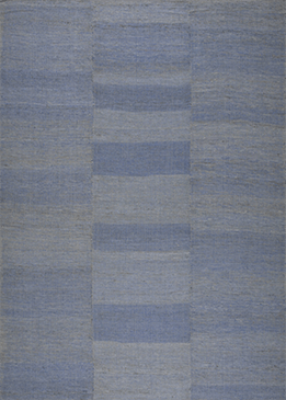
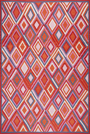
"Displaying a carefree confidence and a daring curiosity that animates our creative spirit, inquisitive and intriguing PANTONE 17-3938 Very Peri helps us to embrace this altered landscape of possibilities, opening us up to a new vision as we rewrite our lives. Rekindling gratitude for some of the qualities that blue represents complemented by a new perspective that resonates today, PANTONE 17-3938 Very Peri places the future ahead in a new light.
We are living in transformative times. PANTONE 17-3938 Very Peri is a symbol of the global zeitgeist of the moment and the transition we are going through. As we emerge from an intense period of isolation, our notions and standards are changing, and our physical and digital lives have merged in new ways. Digital design helps us to stretch the limits of reality, opening the door to a dynamic virtual world where we can explore and create new color possibilities. With trends in gaming, the expanding popularity of the metaverse and rising artistic community in the digital space PANTONE 17-3938 Very Peri illustrates the fusion of modern life and how color trends in the digital world are being manifested in the physical world and vice versa."
What can we say that Pantone hasn't already captured in their statement, other than we look forward to seeing what you do with this strong color choice? Will you contrast it with additional colors, or keep it contained? However you work with the 2022 color of the year, we're sure it will be impactful, as per the nature of it's vibration.
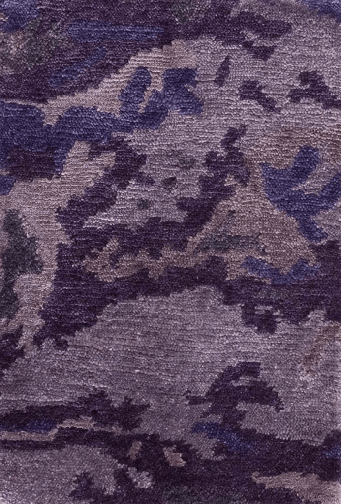
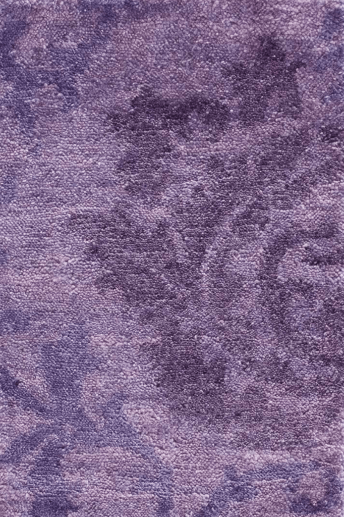
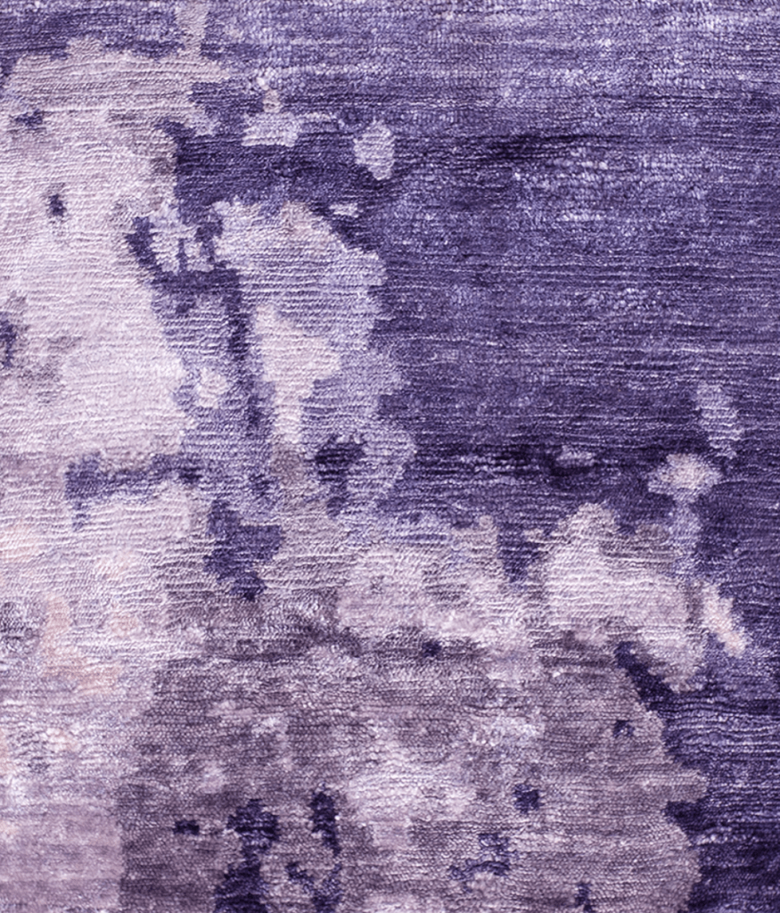
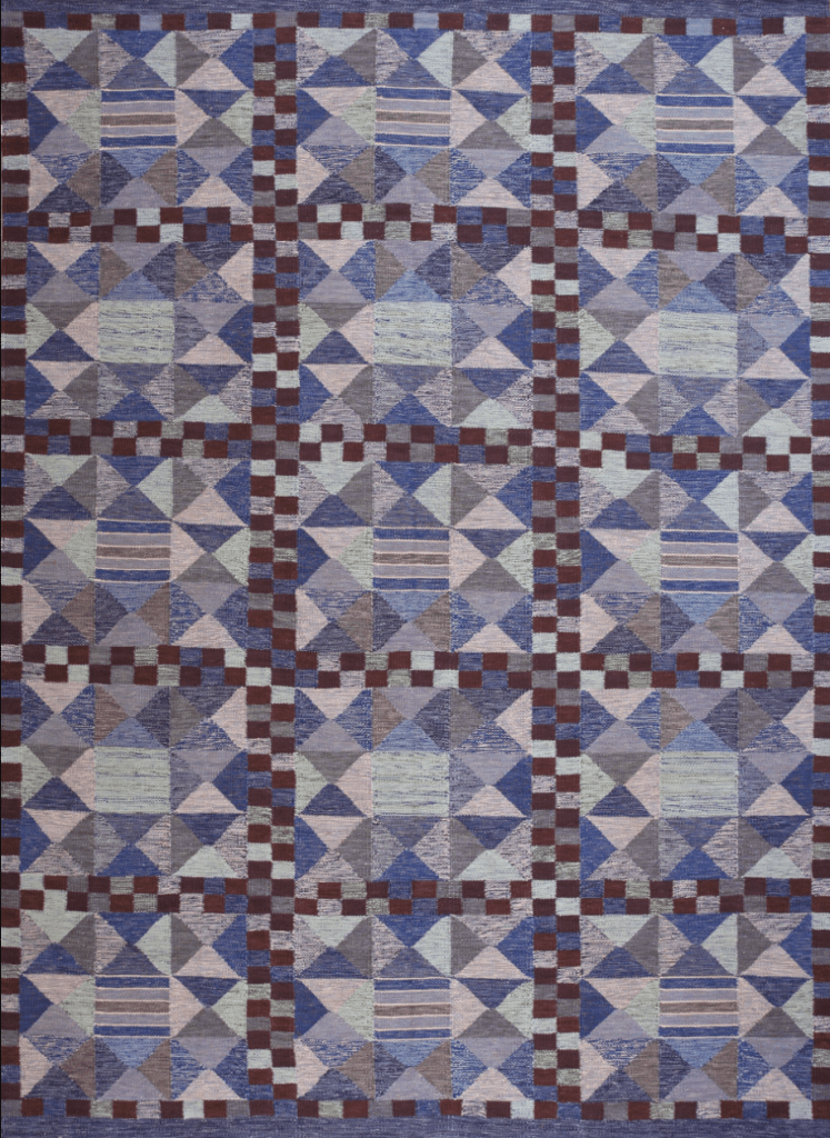
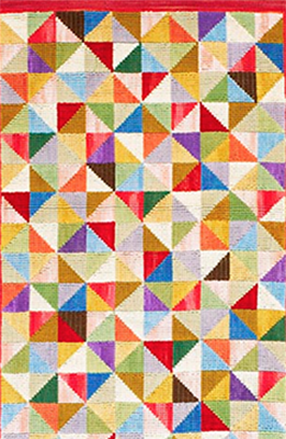
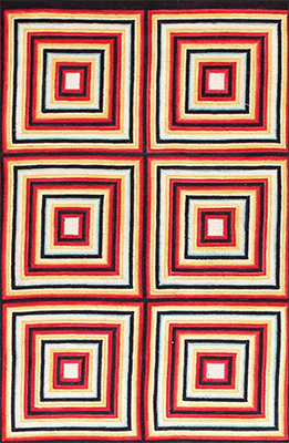
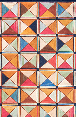
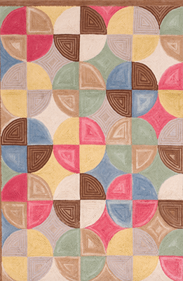
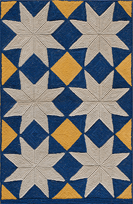
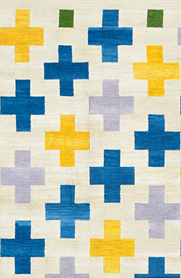
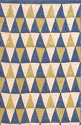
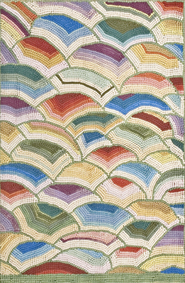
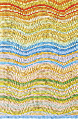
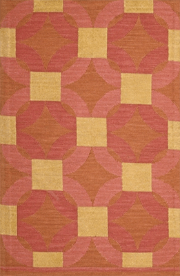
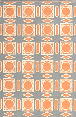
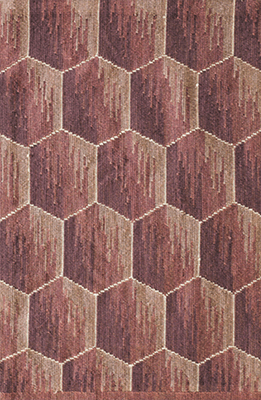
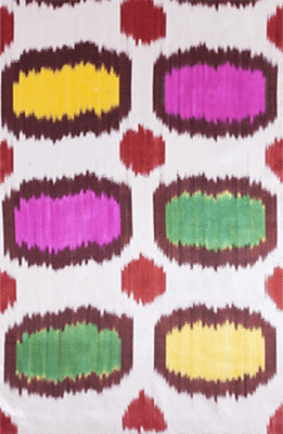
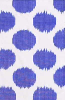
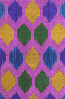
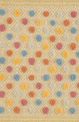
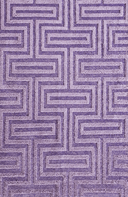
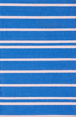
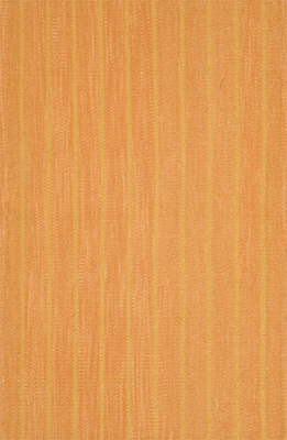
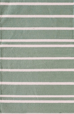
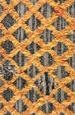
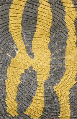
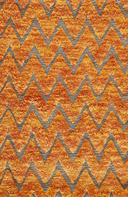
As an ode to this hue, we've put together a little inspiration in the rug department. Some of these choices may fully embrace Very Peri in their essence, while others may only accent it, and we're excited to see which way you lean.
Please remember that all of our wonderful carpets are fully customizable to your specific needs, be it color, size, or design - if you can envision it, we can create it. Browse our collections, or contact us to get started today.
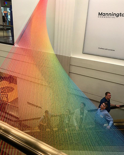
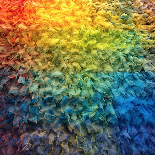
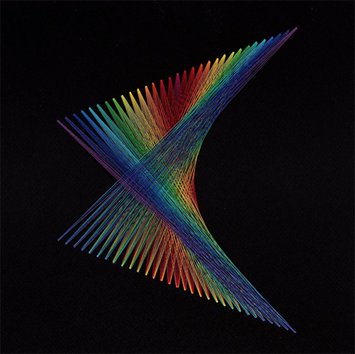
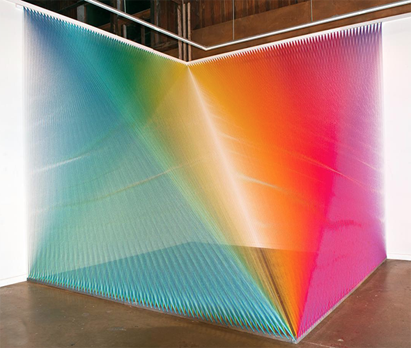
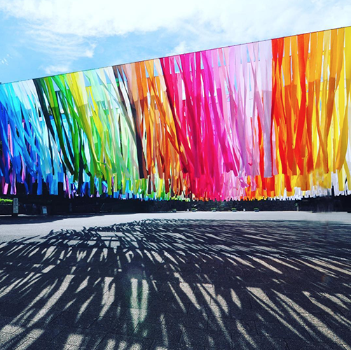
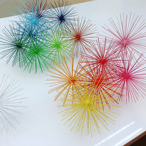
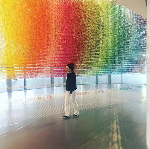
Gabriel's work is obviously rooted in a fascination with light and color, and seems to visually interpret how the spectrum moves and bends in unseen layers. The way that his Plexus series of installations juxtaposes the scale of space with the scale of material to create deceptively holographic imagery which captures the essence of a rainbow that can be physically experienced is incredible.
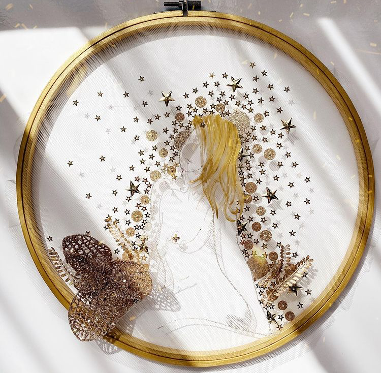
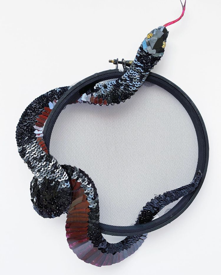
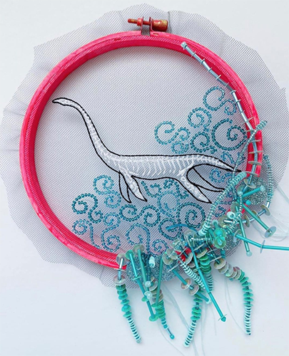
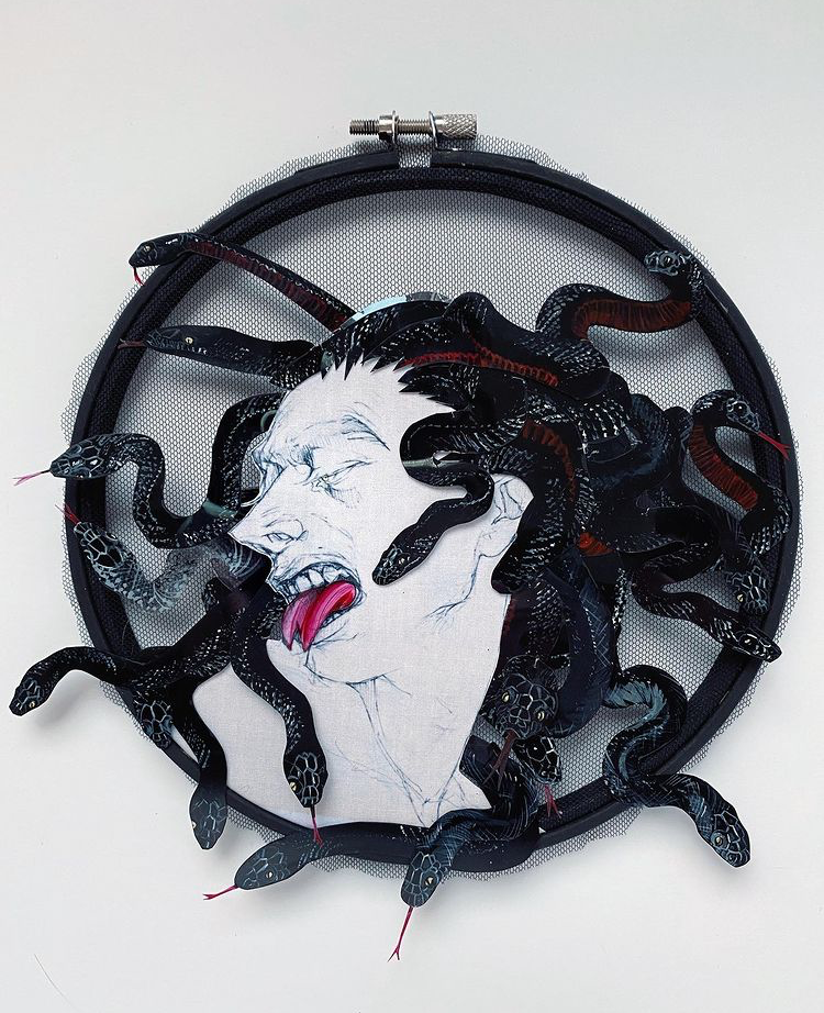
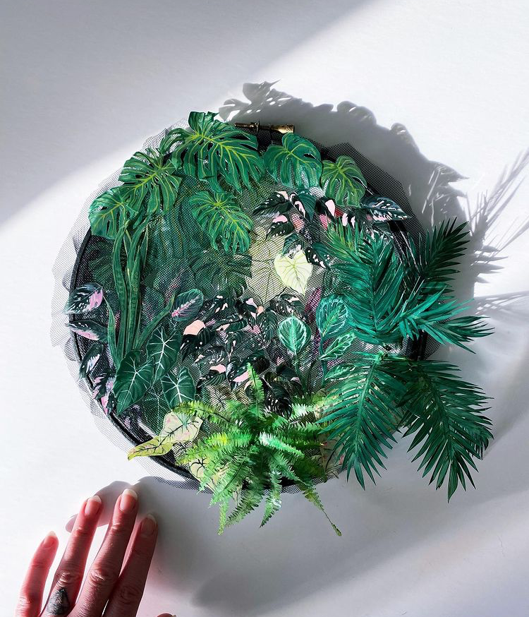
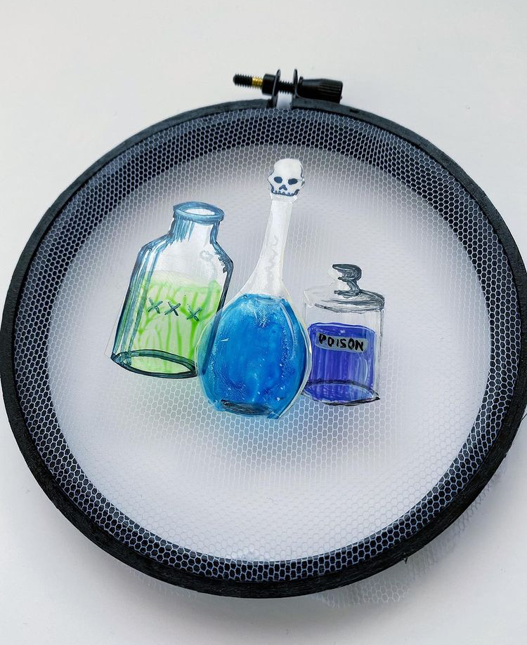
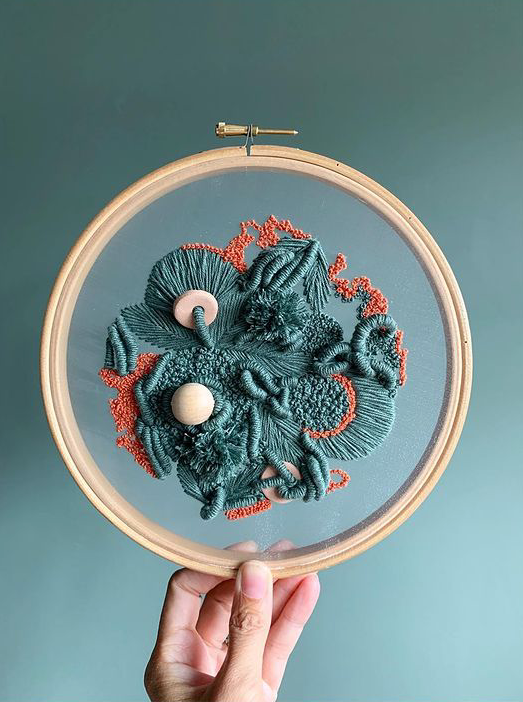
Beginning with an embroidery hoop and some mesh, Breeyn creates work that jumps off the hoop with glamorous embellishment, and often displaying dark and mythical concepts. Her work is where embroidery meets sculpture in fascinating ways and with a variety of materials.
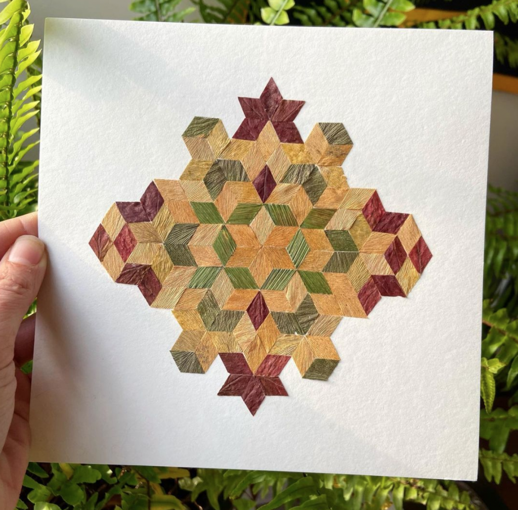
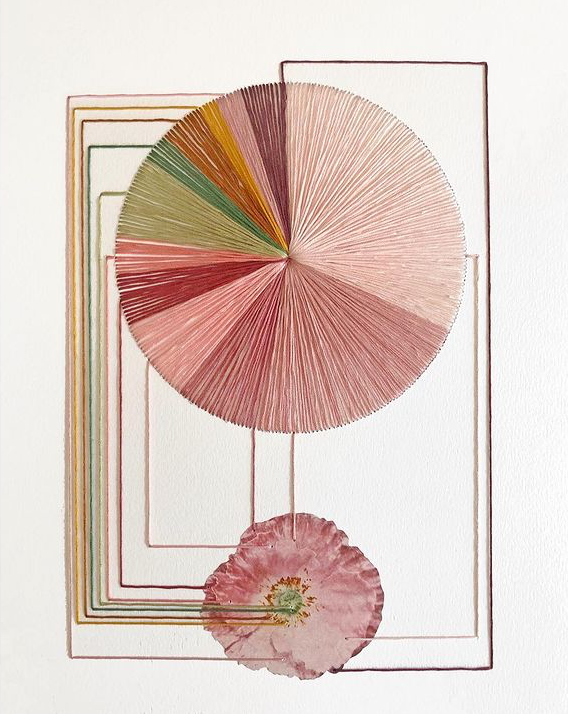
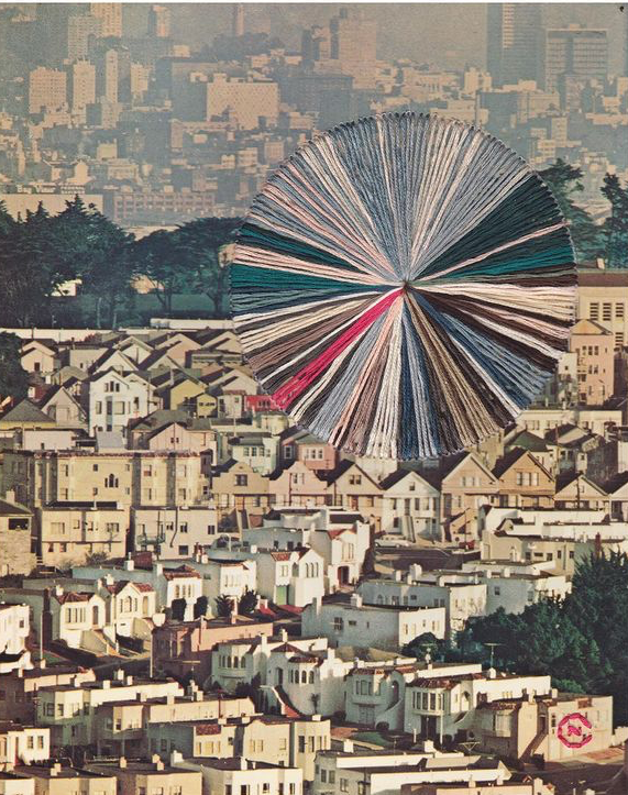
There's something very natural about the draw that Julia's work has. It seems to be a place where nature meets geometry in unusual ways; there's a sort of sacred language that speaks from her pieces, connecting to a life force within each of us. It's structural, yet organic; mysterious, yet familiar - drawing our attention towards the details of each section.
Using the purest form of material, Meghan explores the vast chasm of scale and texture to create works of art that compel us to think. Visual expression of certain concepts and realities come to mind when we view her work, and while the material content doesn't vary from one piece to the next, the imagery and feelings recalled by them do.
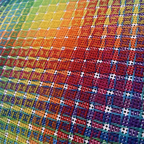
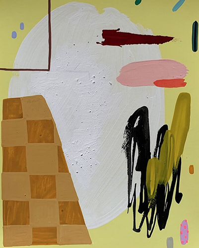
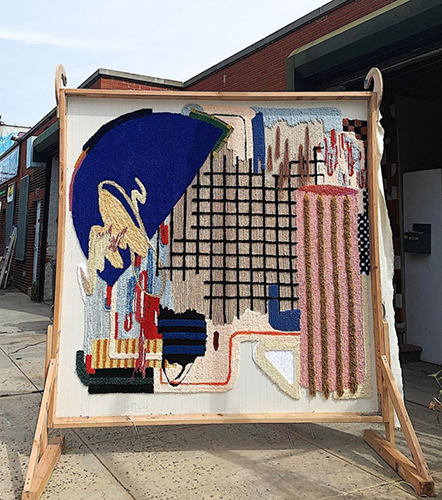
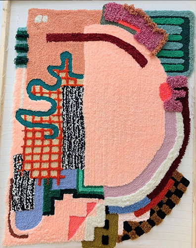
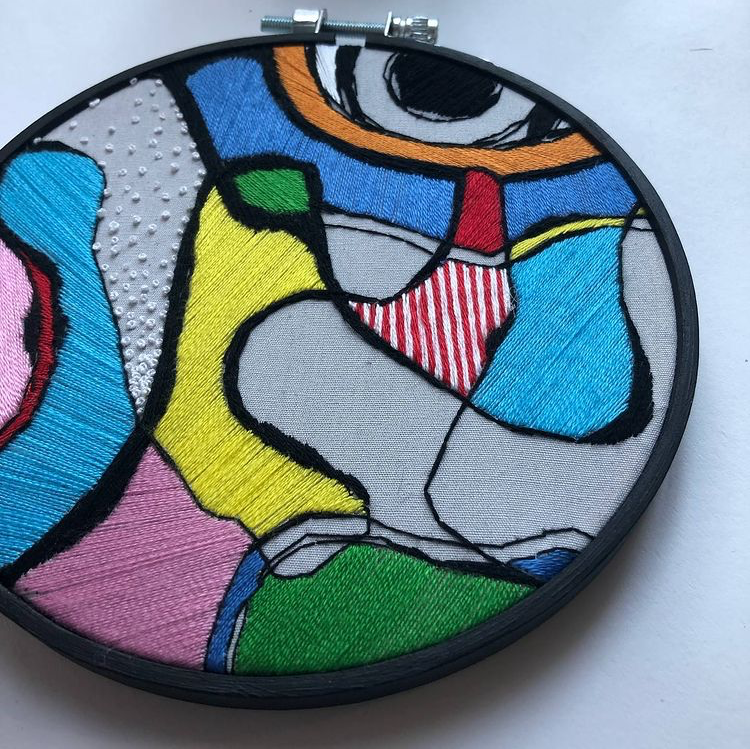
Caroline's work is playful and geometric, and there is an obvious connection between her tufted art and her paintings and hand drawn art - the rugs even seem to retain a sketched quality to their line work and color. We just love scrolling through her ever evolving body of work and watching how each medium influences the next.
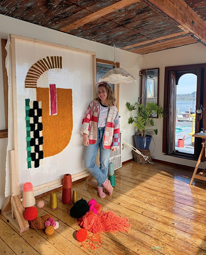
"Over the past 6 years my studio focus has shifted from fashion to knitwear to painting to rug making and textile art. all of these practices are fueled by curiosity, play, and exploration of process. Instagram has become an extension of my sketchbook, my studio diary...pursuing a creative career is a winding path, and sometimes very bumpy."
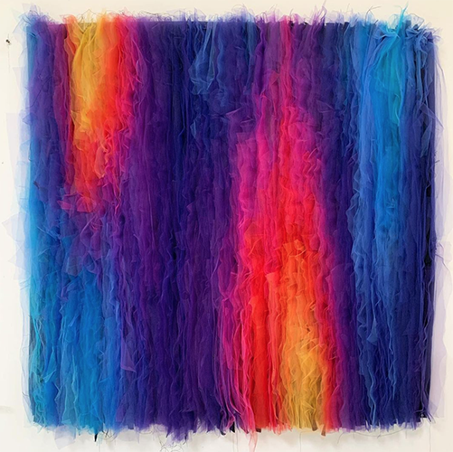
Sarah has traditionally explored her identity as a Peruvian American artist by visiting concepts of feminine identity and value through handmade objects. Using a plethora of materials she questions systems, traditions, and cultural relevance through art. Many of her recent works serve as colorful, textural, and sculptural narratives to experience a link with the history of her culture.
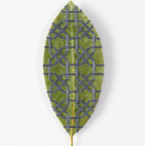
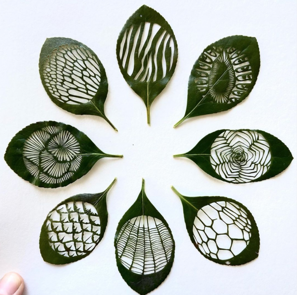
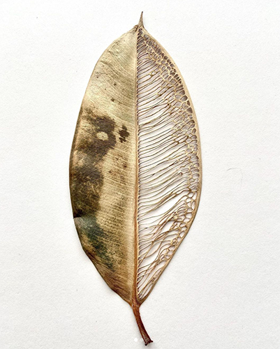
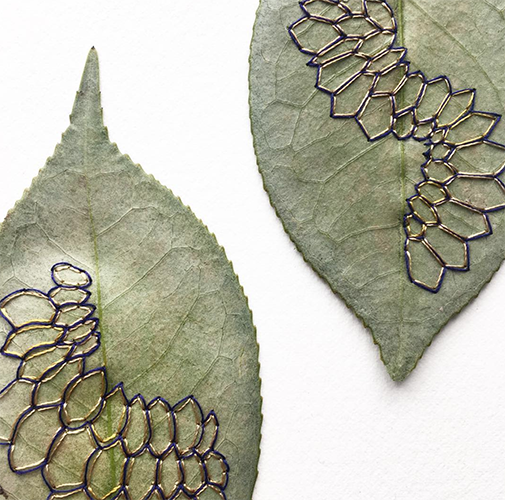
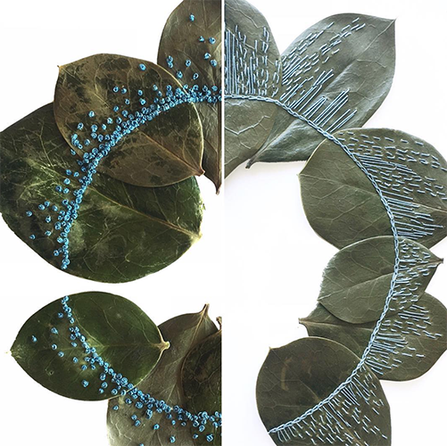
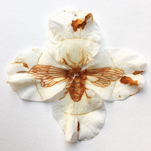
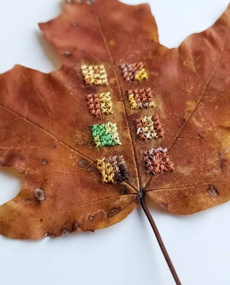
Hillary's work never ceases to amaze us. The compelling connection to nature by way of embellishment to the elements of it's growth are inspiring. The way that she adds to or takes away from such delicate parts of life are quite honestly mind blowing - as I try to imagine myself doing this task I am already frustrated by the leaf cracking in my hand as I touch it. It is clear that she has a well practiced hand in the accomplishment of her art.
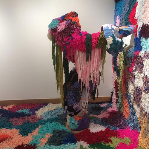
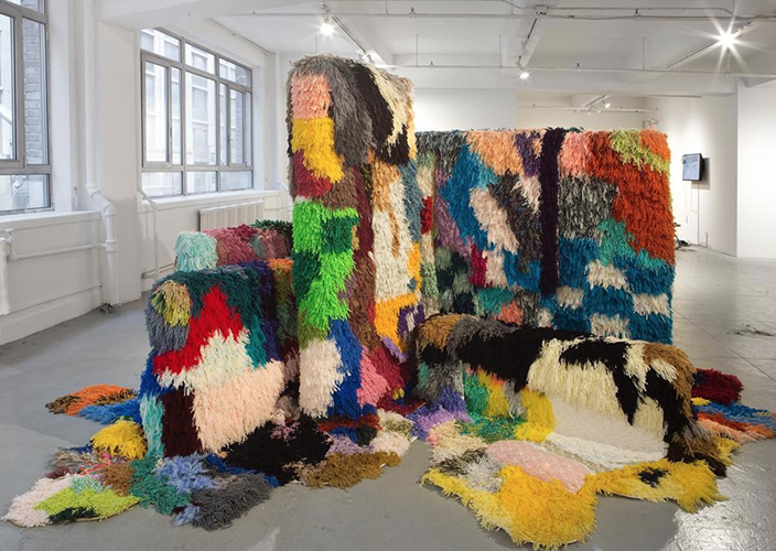
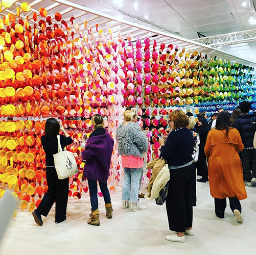
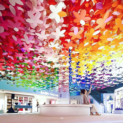
While all of Emmanuelle's work is not per-say fiber art, it is definitely inspired by fibrous construction in the many layers and colors of production. The grandiose scale of work is compelling on its own, but the bright rich colors attract the eye and the soul, encouraging us to walk around and through these installation experiences in awe.
*all images copyright of the artists.
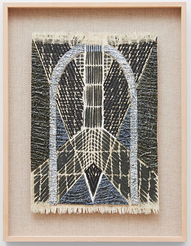
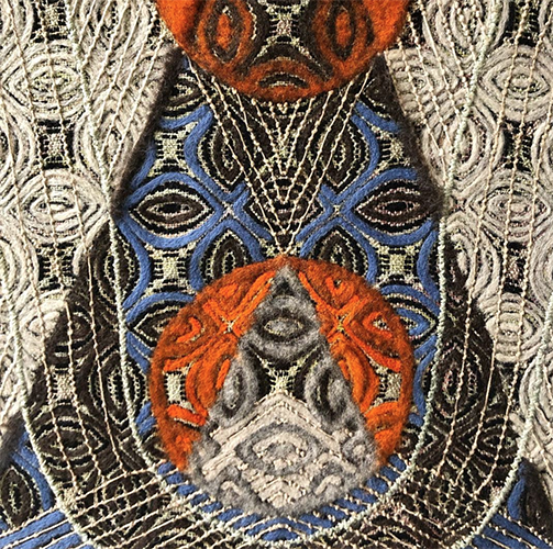
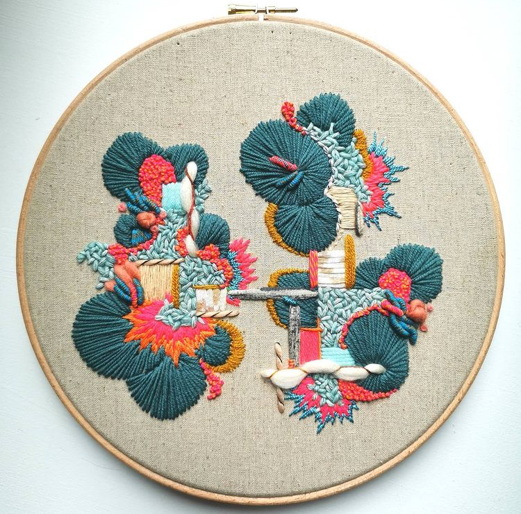
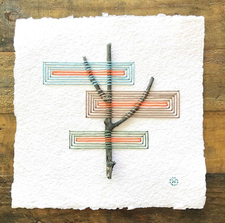
There are so many ways to communicate ideas through fiber arts, and embroidery is one form that we tend to think of as a tradition lost in time. We connect these strings of thought to a period where girls were taught to do needlework as a right of passage; we immediately think of cross-stitching and flowers. But, in the modern world many women have owned this craft and experimented with various and unique ways of expressing themselves through thread.
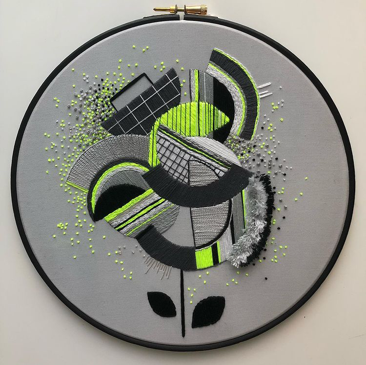
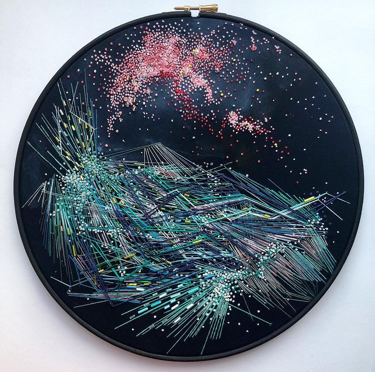
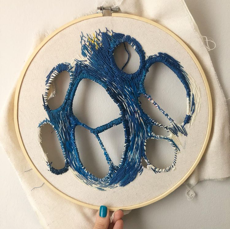
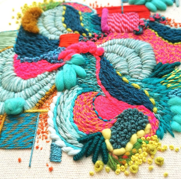
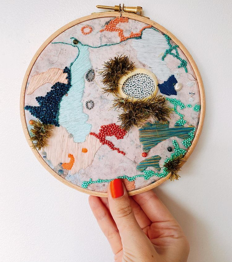
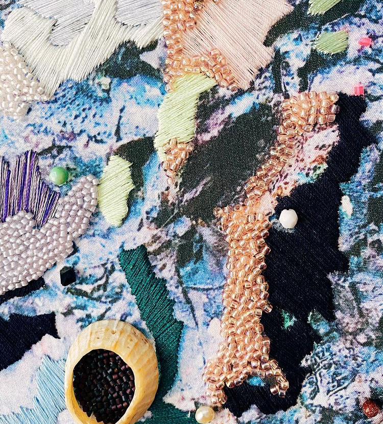
What we love most about Stacey's work is her incredible use of color and composition. Her skilled execution of stitches and layering are also impressive. We never get bored looking at her page, as her style always seems to be evolving - going through a variety of applications of her medium; from geometric to free flowing, abstract to natural, and sometimes scientific and cellular.
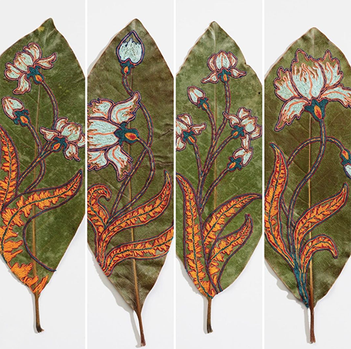
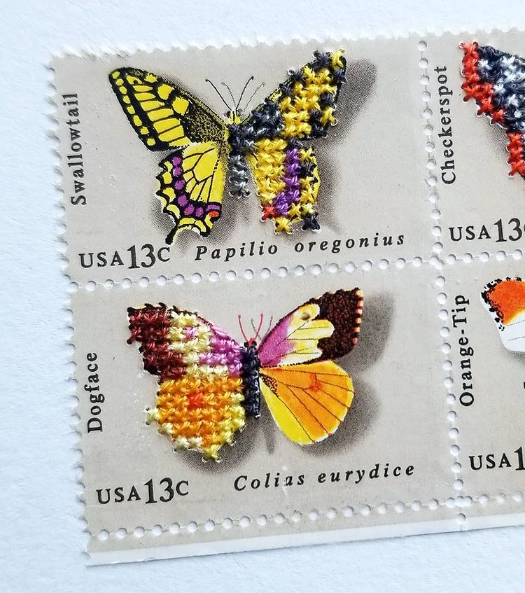
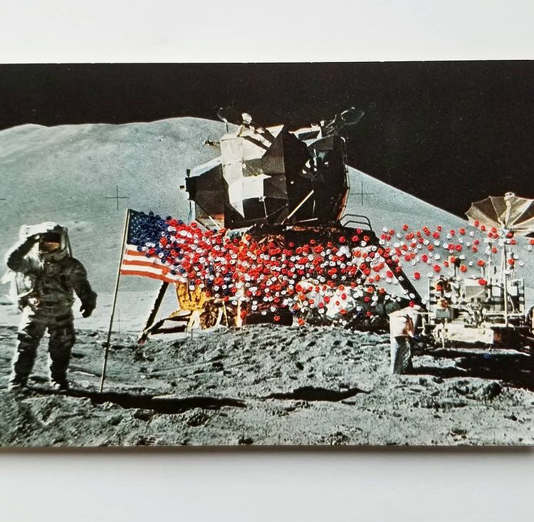
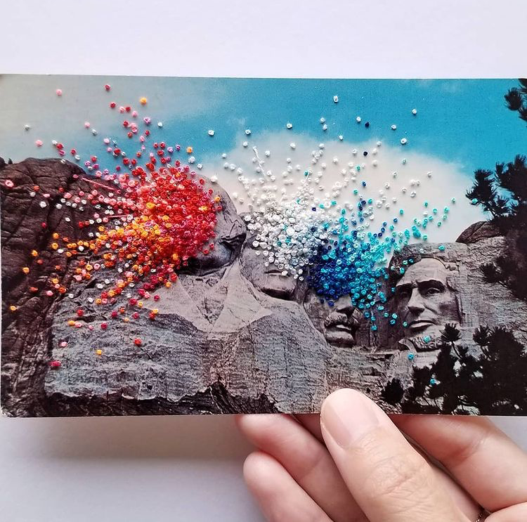
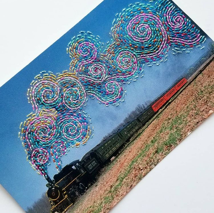
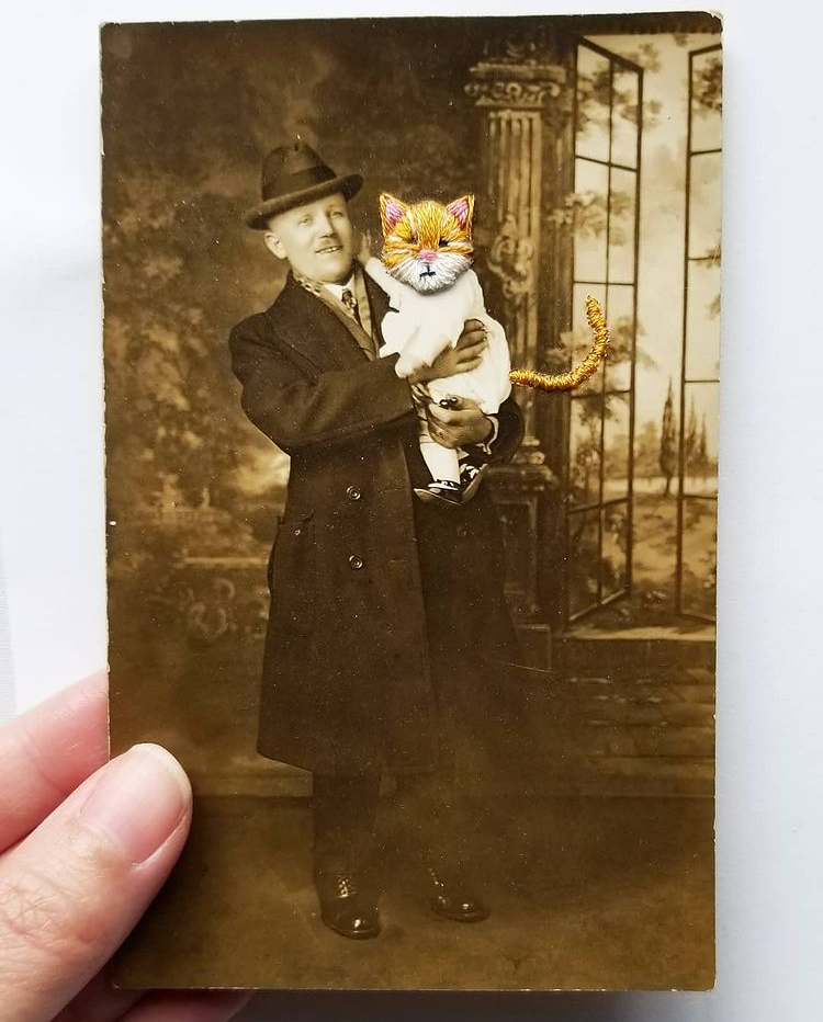
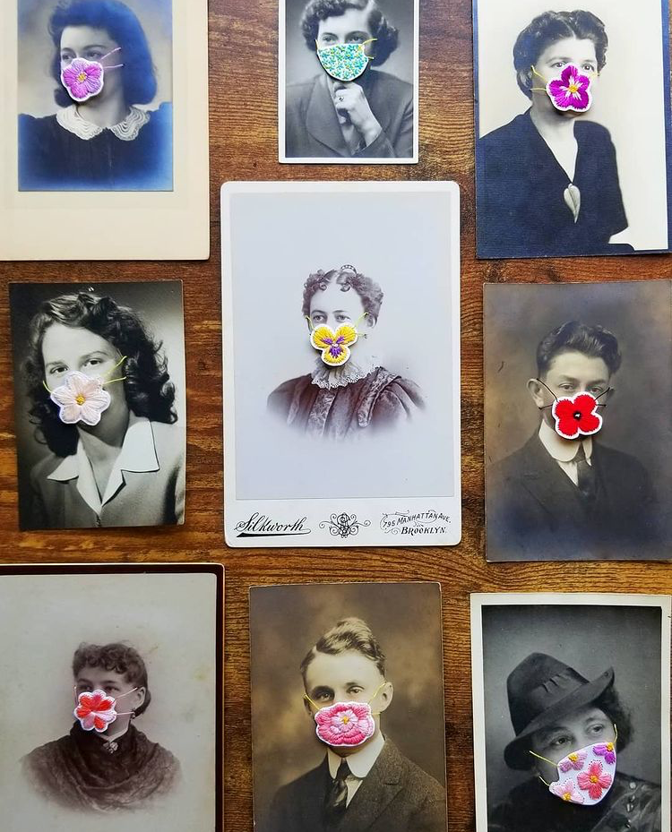
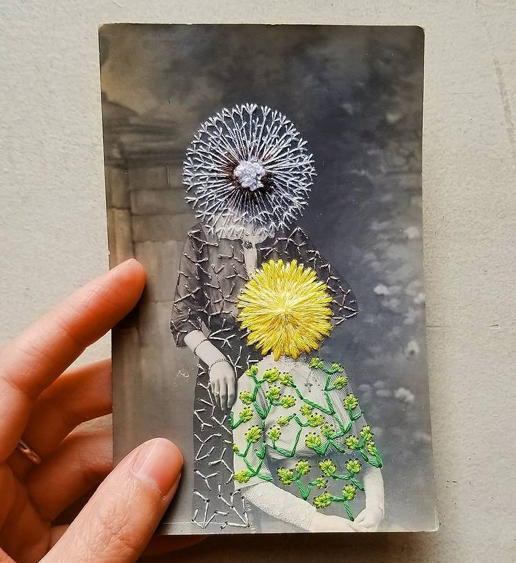
Han's playful experimentation of medium and imagery is grossly appealing. The way she embellishes photos, postcards, stamps, and natural elements weaving together concept and form is uniquely fascinating.
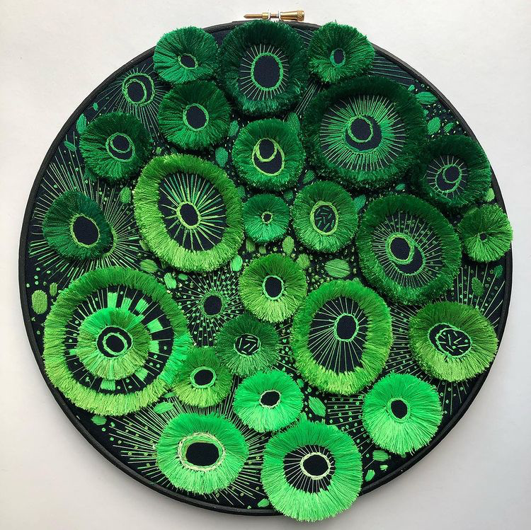
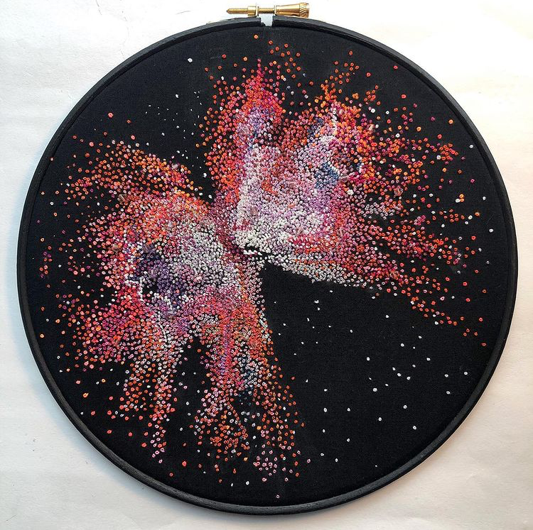
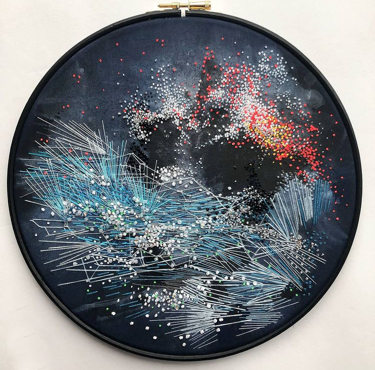
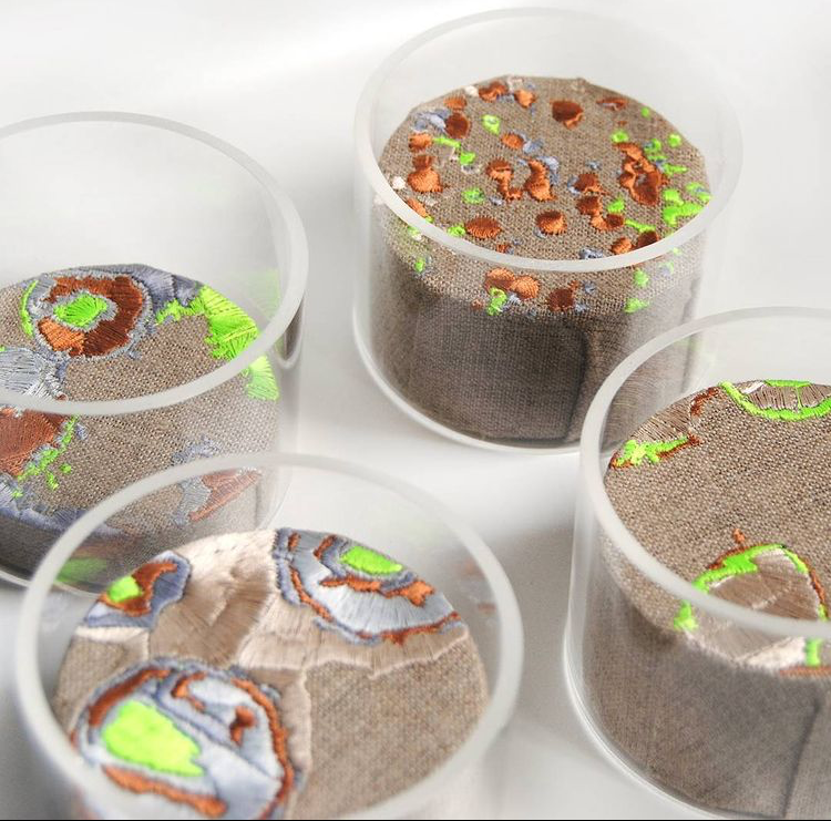
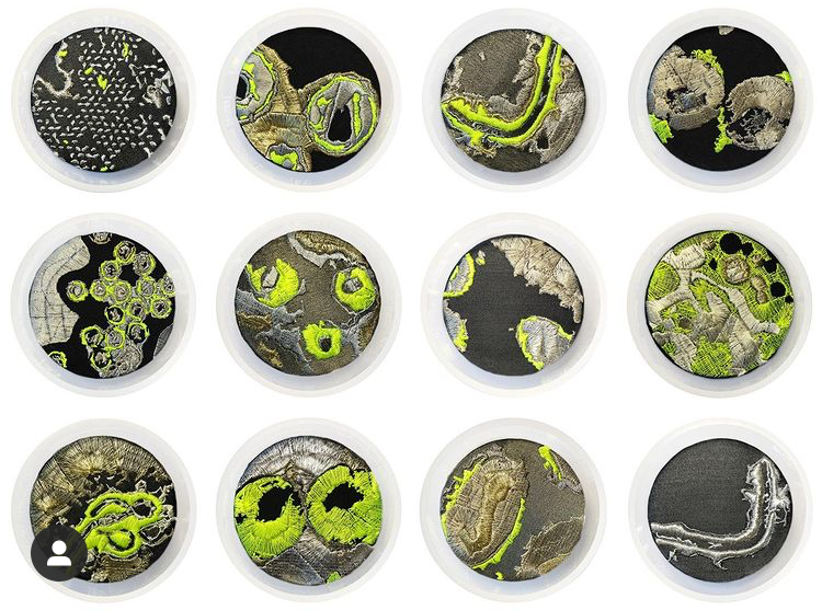
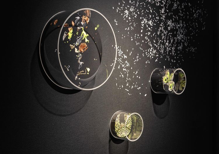
Is there something familiar about her work? Absolutely. Knie states, "I’ve been embroidering viruses for over 8 years now", and with the impact that Covid-19 has had in the world, this seems more contextual now than ever before. Her love of science and space are apparent in her work, and we love the way her stitches preserves microscopic views.
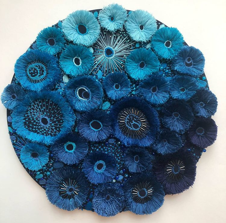
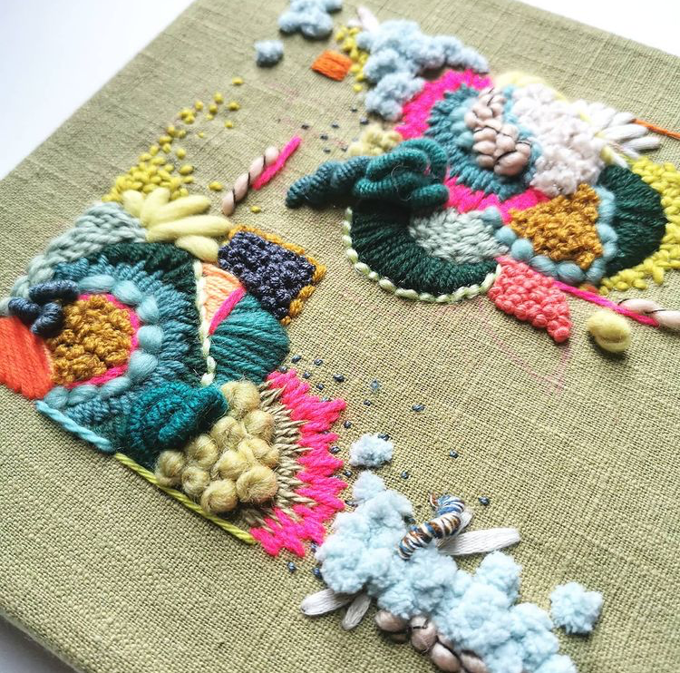
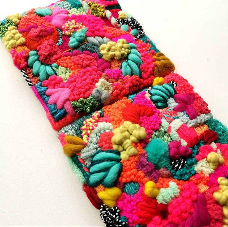
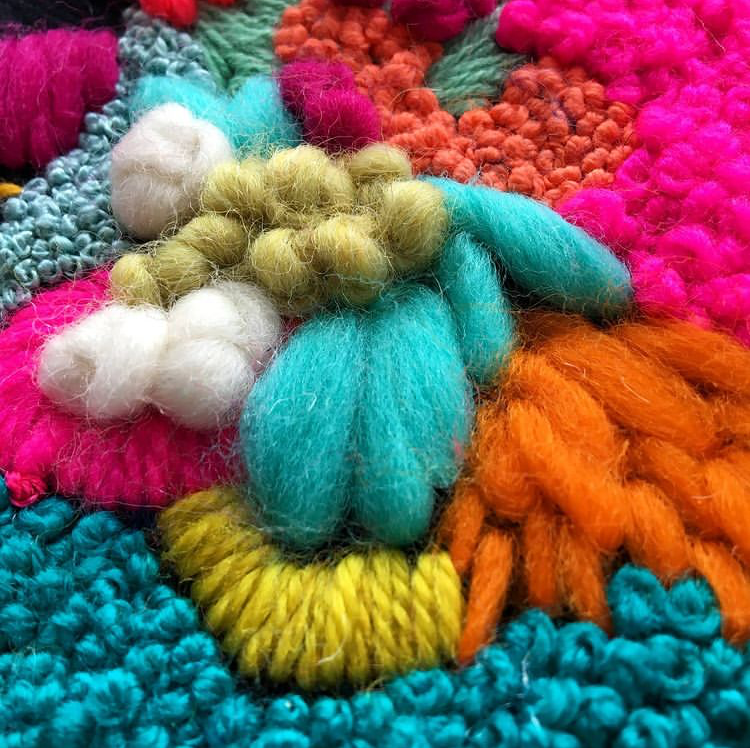
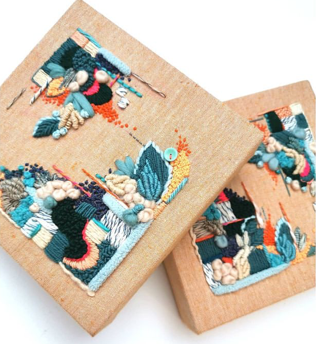
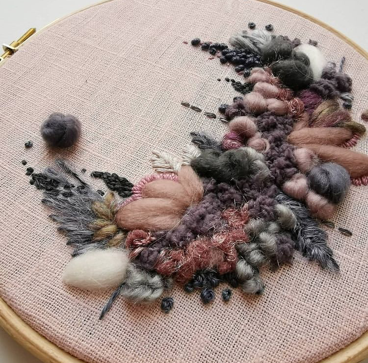
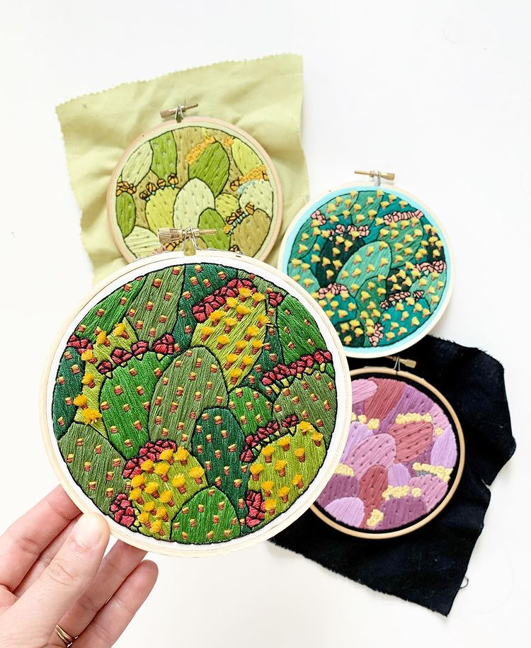
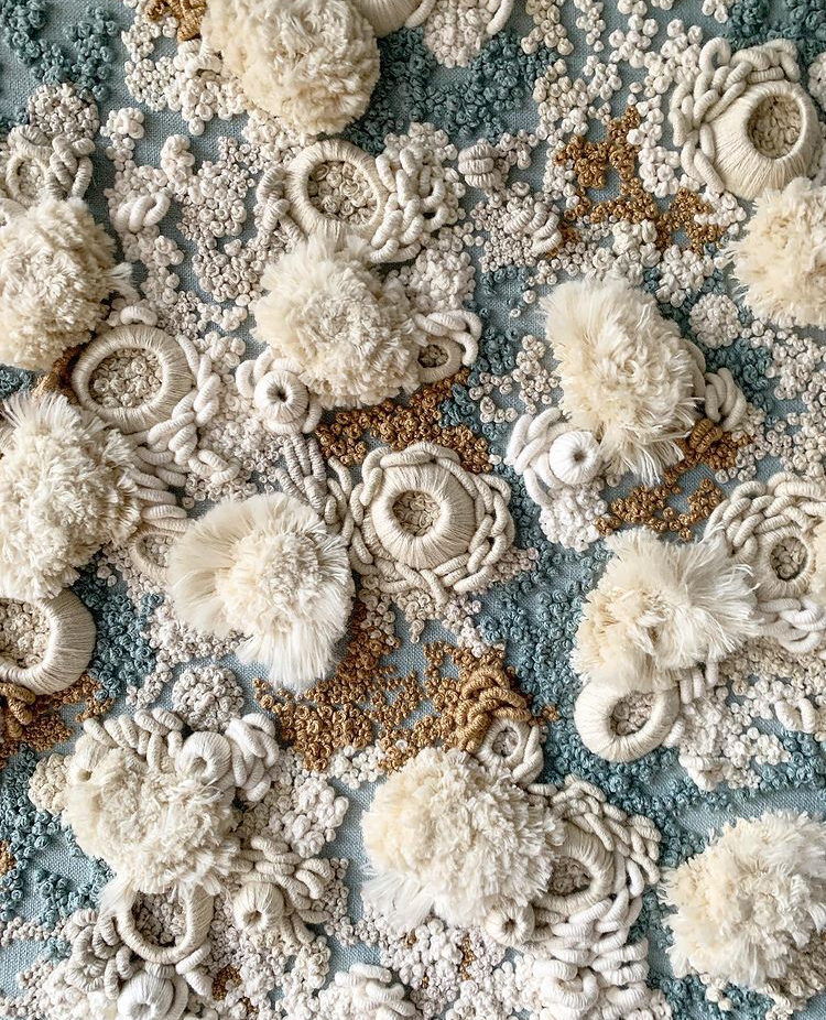
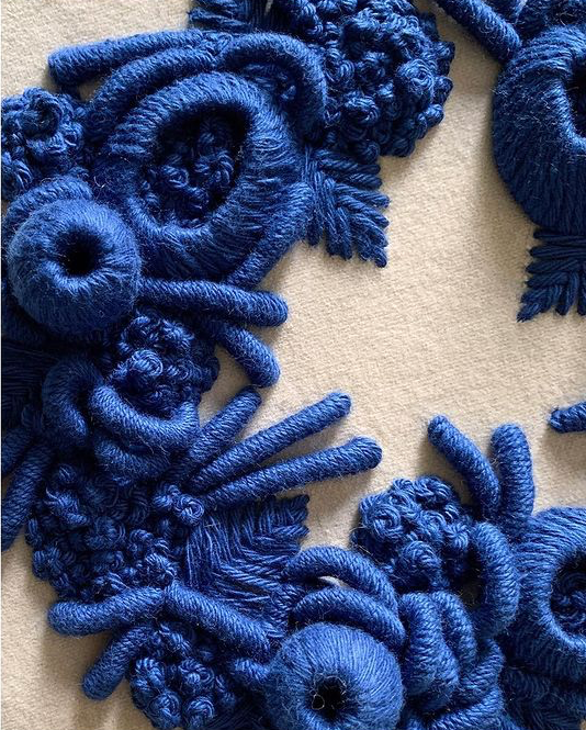
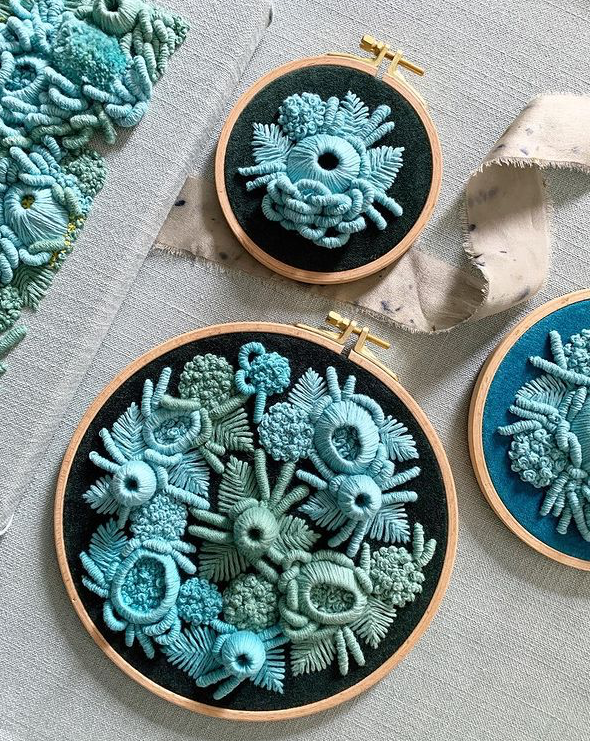
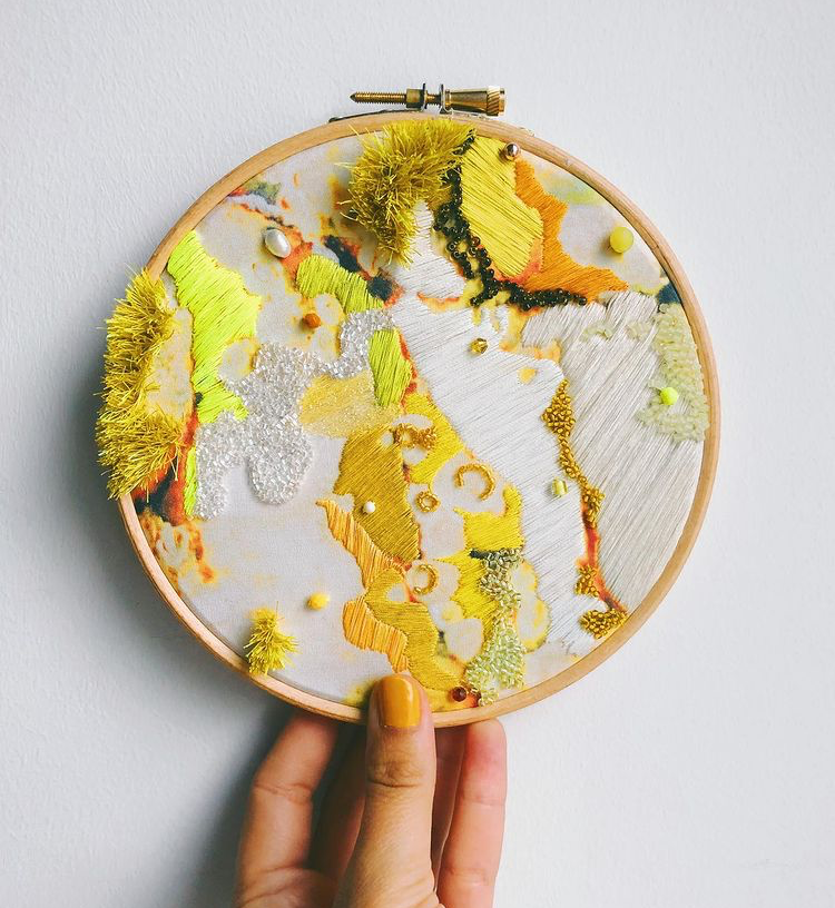
If texture is your thing, Hughes nails it. Her use of a variety of threads and yarns, each with their own unique properties, combine in 3 dimensional application for a finished product that is bursting with color and personality. There's something abstractly floral about her work, which bursts off the hoop like a beautiful bouquet.
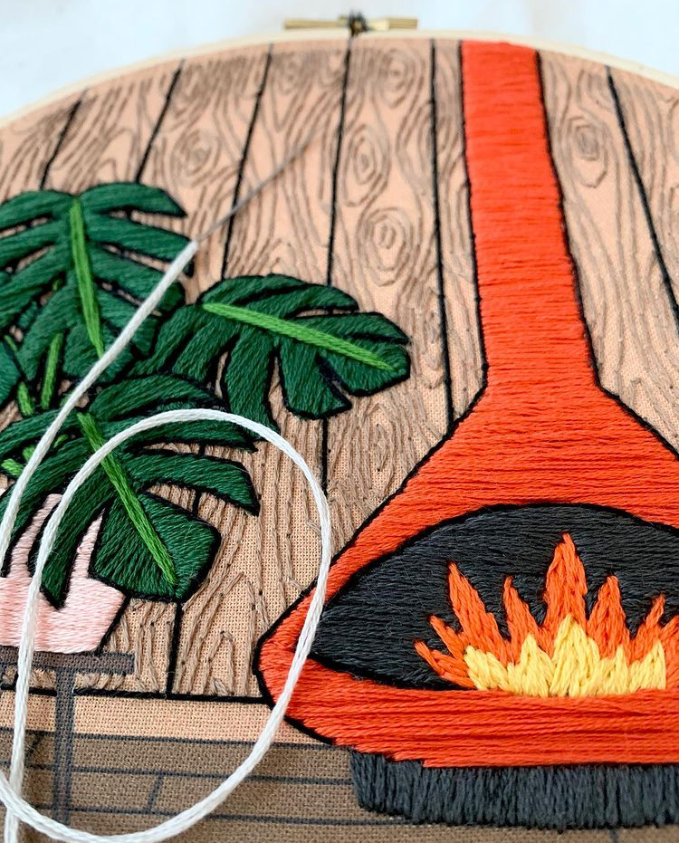
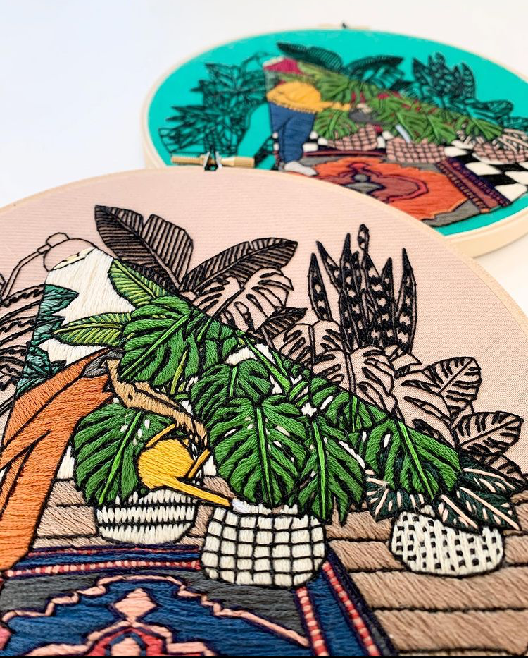
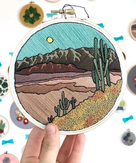
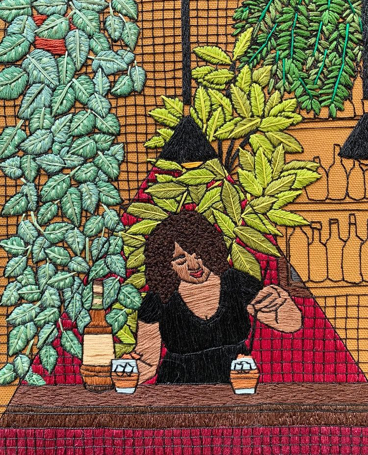
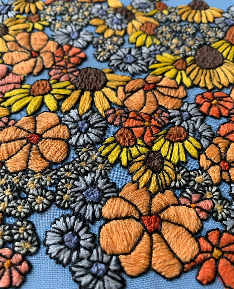
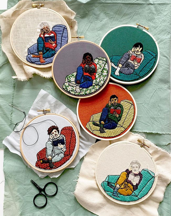
Bennings' pictorial embroidery has an illustrative quality to it that is so graphic in nature, we would love to see it in book format (an embroidered book). Her focus seems to be plant life, but she also captures landscapes and personal human moments in time (such as reading a good book or mixing a drink).
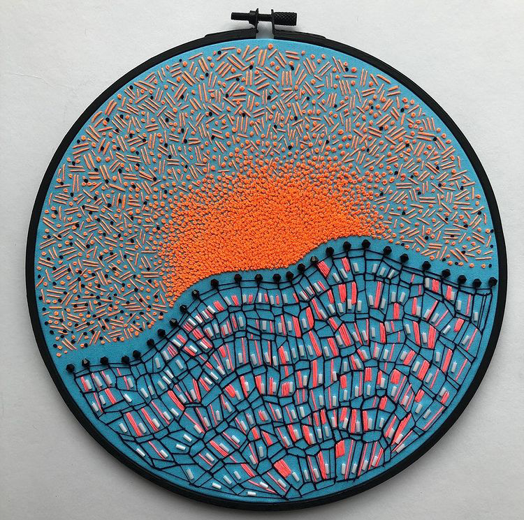
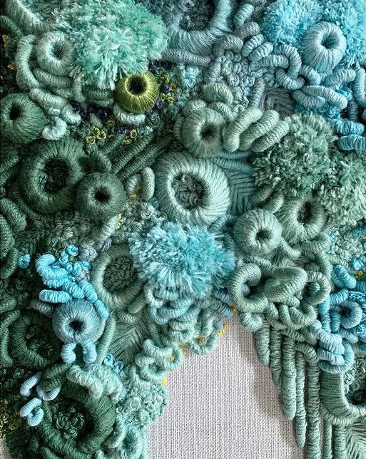
We just love how Wilde's work transports us to the ocean, with textures and 3 dimensional applications that are so realistic that we can't help but hear the lapping of the waves on the sand. Her color selections are very natural and soothing - adding to the connection of environment and application.
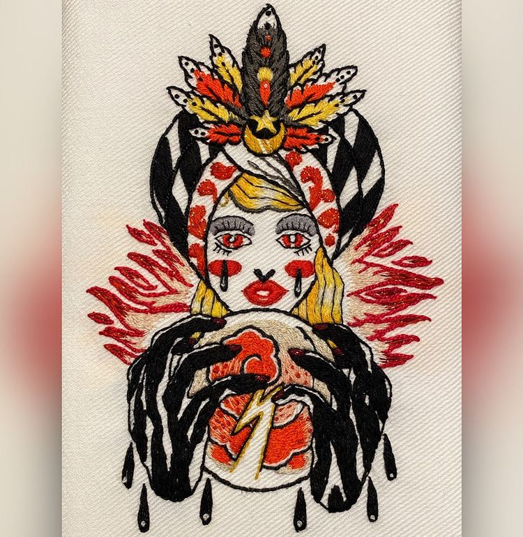
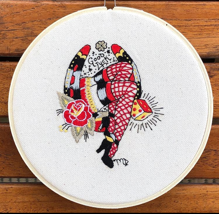
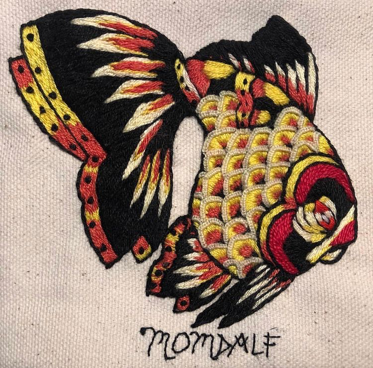
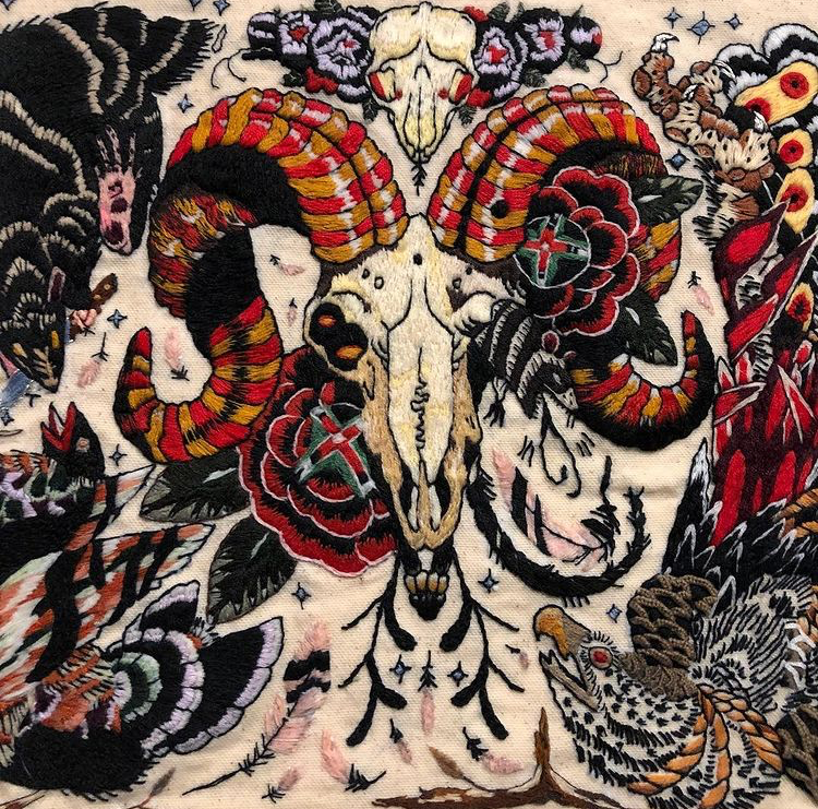
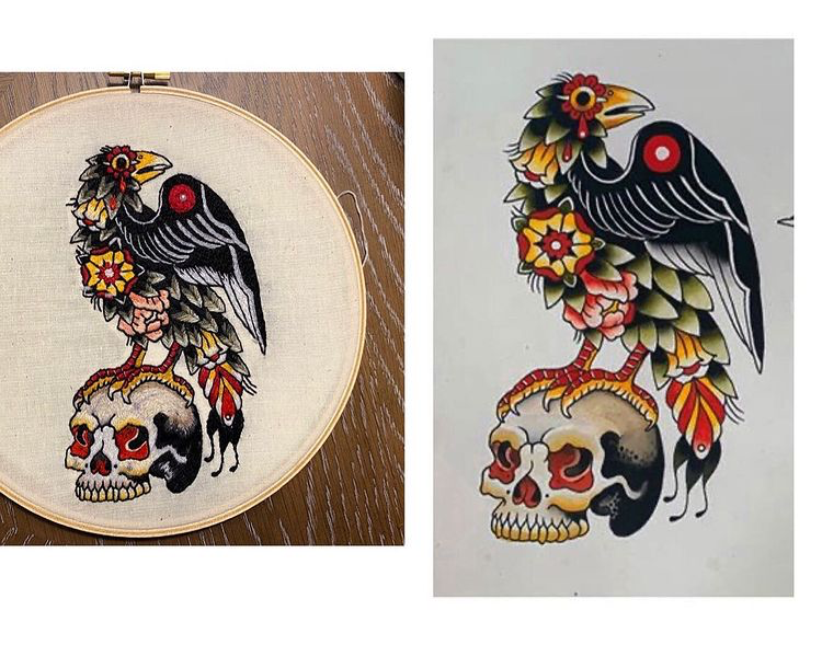
Reinterpreting the tattoo art paintings of her daughter (@gan_dalf) into embroidery so accurately, you almost see it in ink. Besides appreciating the skill of her craft, we love to see a great mother daughter collaboration.
Natalie's work falls into two main categories for us. There's the embroidery on paper using basic lines and geometry, and including natural materials, that has a clean and simple yet powerful appeal. And then there's the dissection of color in imagery, sometimes skewing photos with a time warp reminiscent effect.
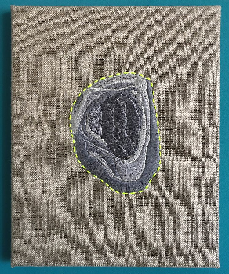
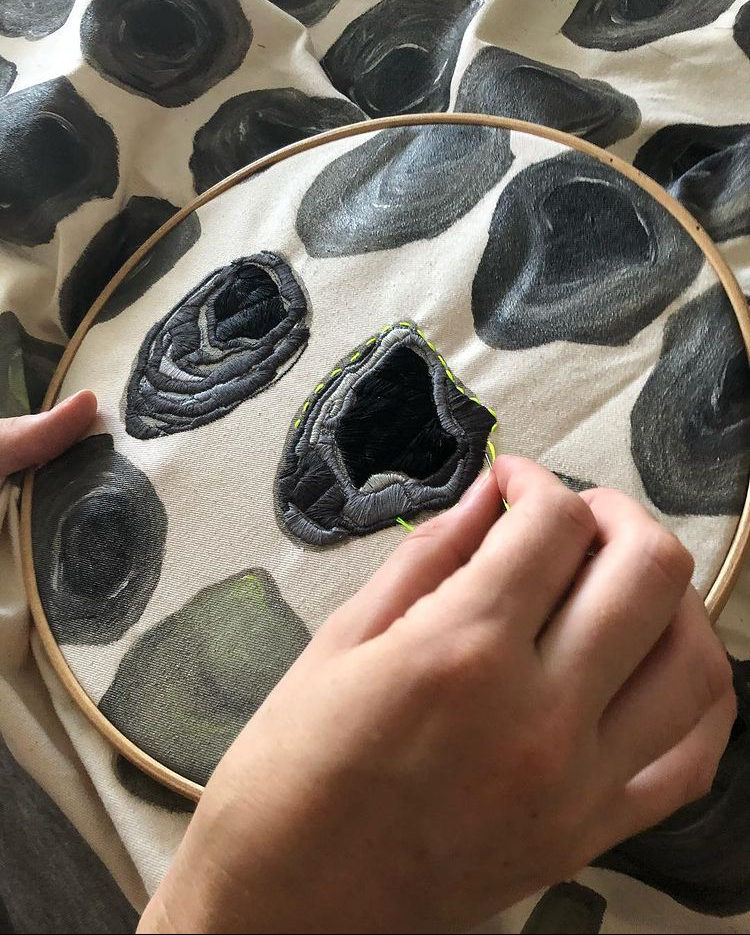
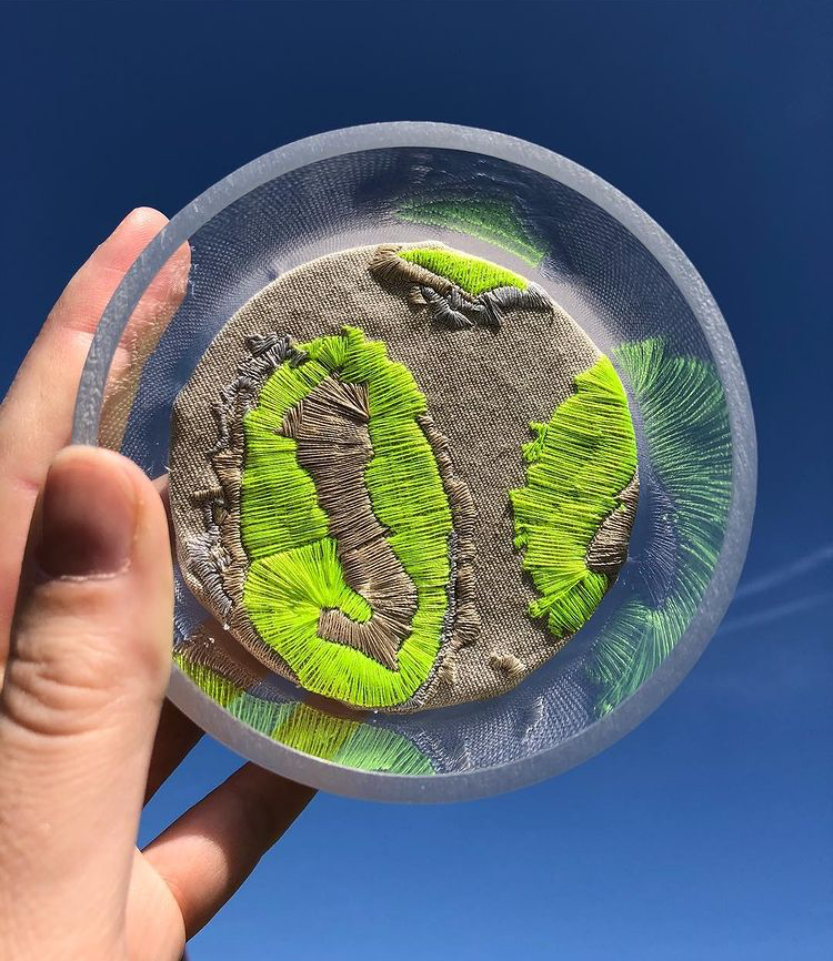
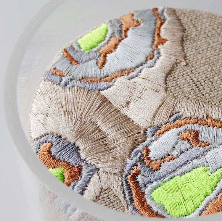
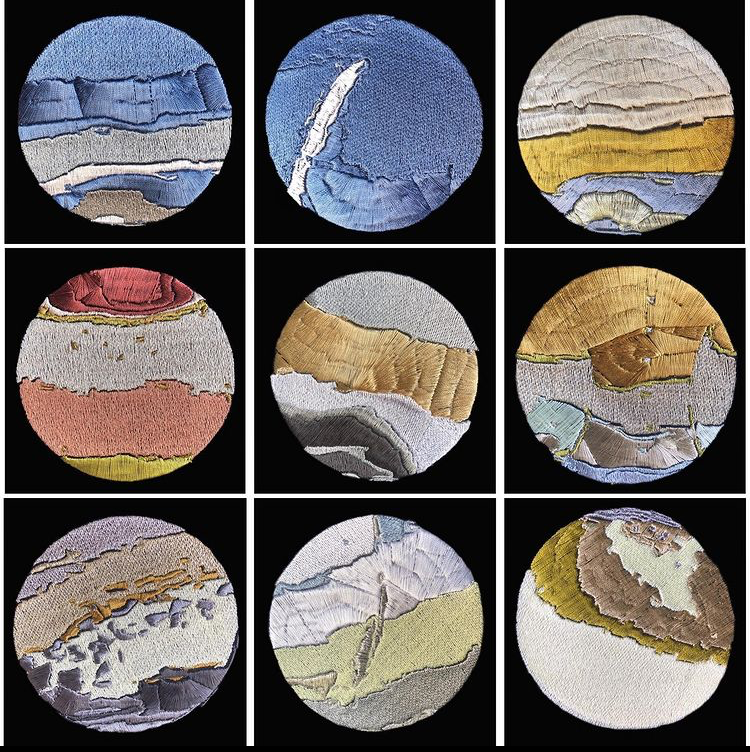
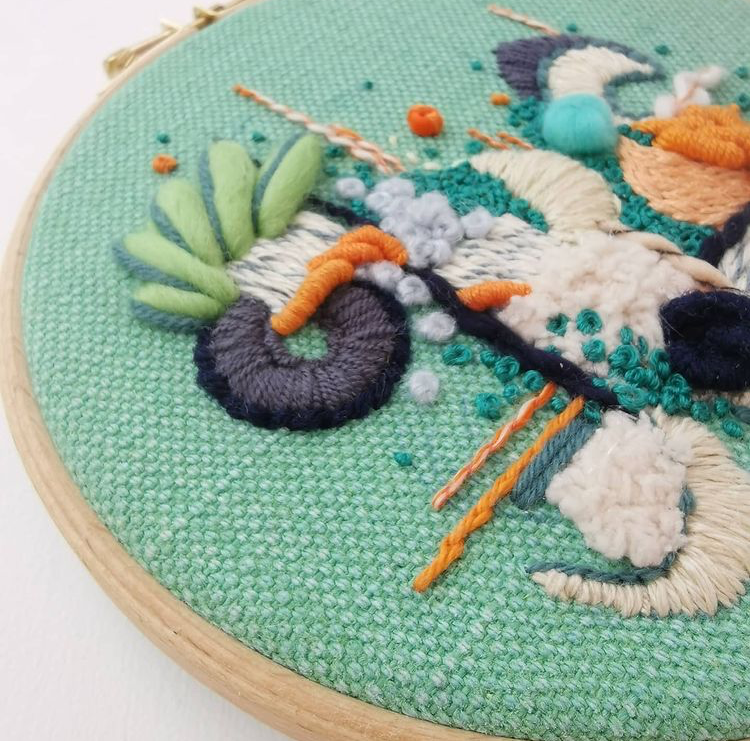
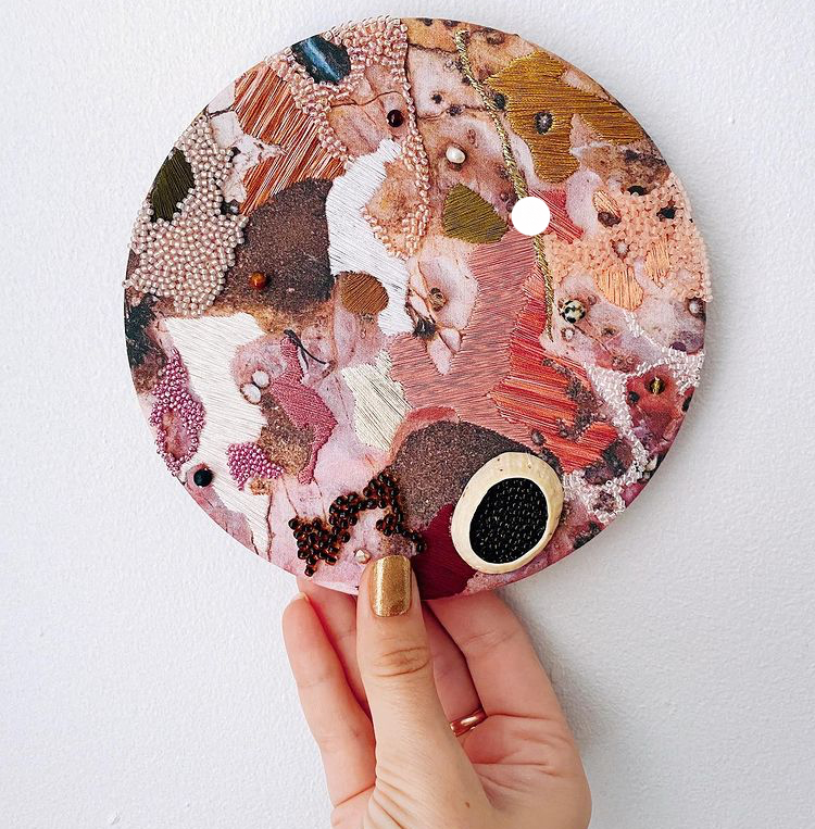
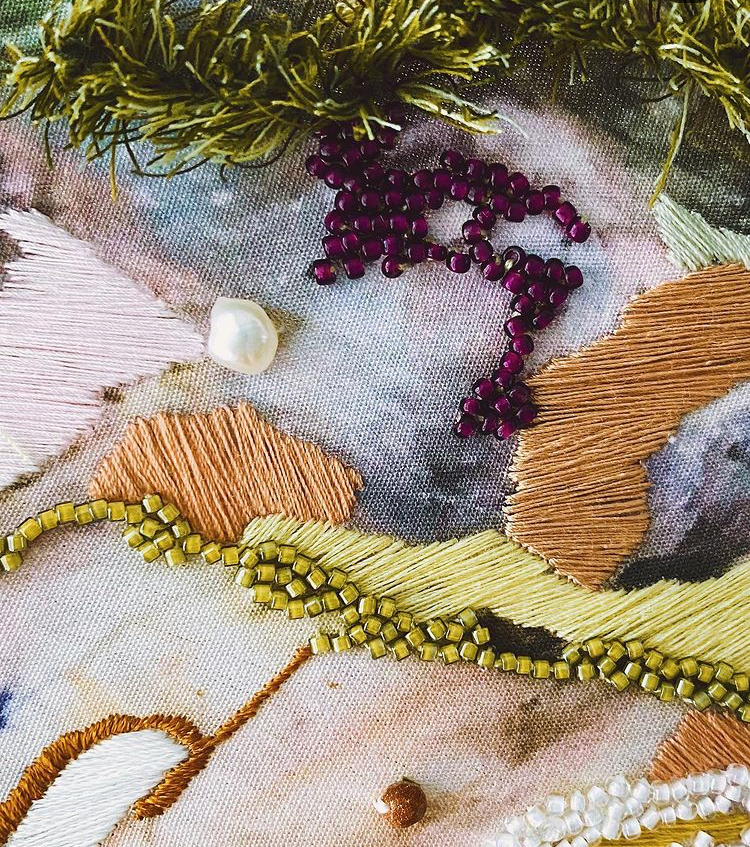
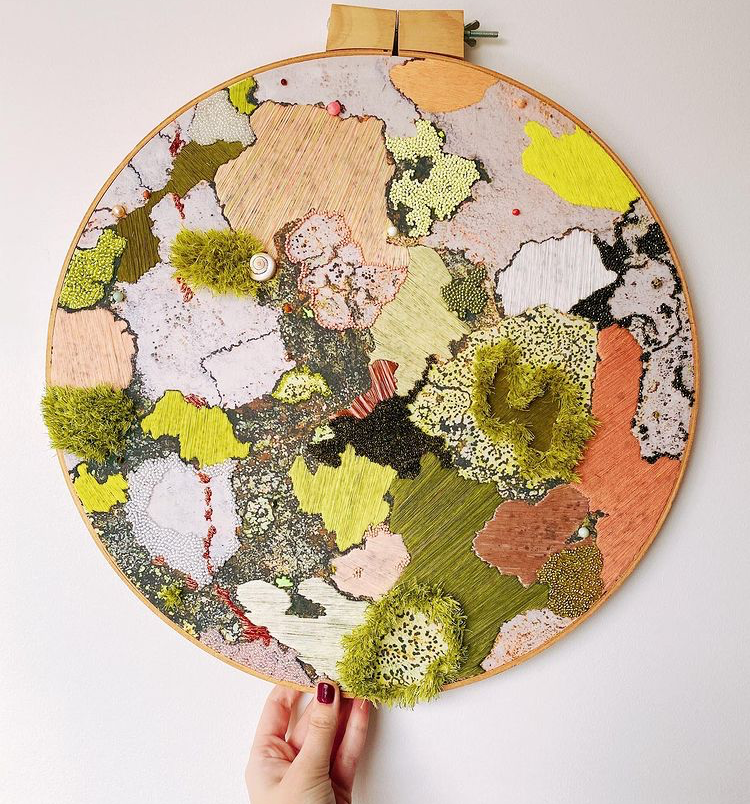
Emily's embroidery inspired by natural textures often brings us to the ocean floor or on a study of geological forms, but there's an abstract quality to the layers she creates which is almost cellular in essence - bringing our thoughts to the base elements of nature's structure.
This year is a learning curve for everyone in so many aspects of life; and now as we find ourselves in a time which traditionally represents back to school, we are learning that changing our traditions is not as easy as we would like it to be.
As our homes become our classrooms, we are pushing ourselves to change the ways that we and our children learn and grow.
It's no secret that basic geometry, bright colors, and interesting textures can enhance creative thought and critical thinking. That's why we're sharing designs which bring us back to the basics of learning.
Colors can enhance our mood too. Lively colors promote a healthy level of energy - which is more important than ever in a world where classes involve sitting in front of a computer all day long.
If we can promote happiness and creativity through the spaces we live (and now work, learn, and play) in, perhaps we can retain some sort of normalcy within the balance of our wold.
Let's try to design spaces which aid us in navigating this new and strange normal.
Let's make it a priority to create compelling spaces to help us do that.
Lets celebrate all the vibrant things that there are to be grateful for in life, by filling our homes with color!
Lets embrace the unexpected new ways of learning in a way that enriches our souls.
While we may still be adjusting to the new systems that we find ourselves navigating, there's no reason we can't have fun while we do that in the most efficient way possible.
Bringing bold colors and basic shapes into our interior environments just might be the basic building blocks we need to move forward into this new system of education we find ourselves in, and may even enhance our learning curve in a positive way.
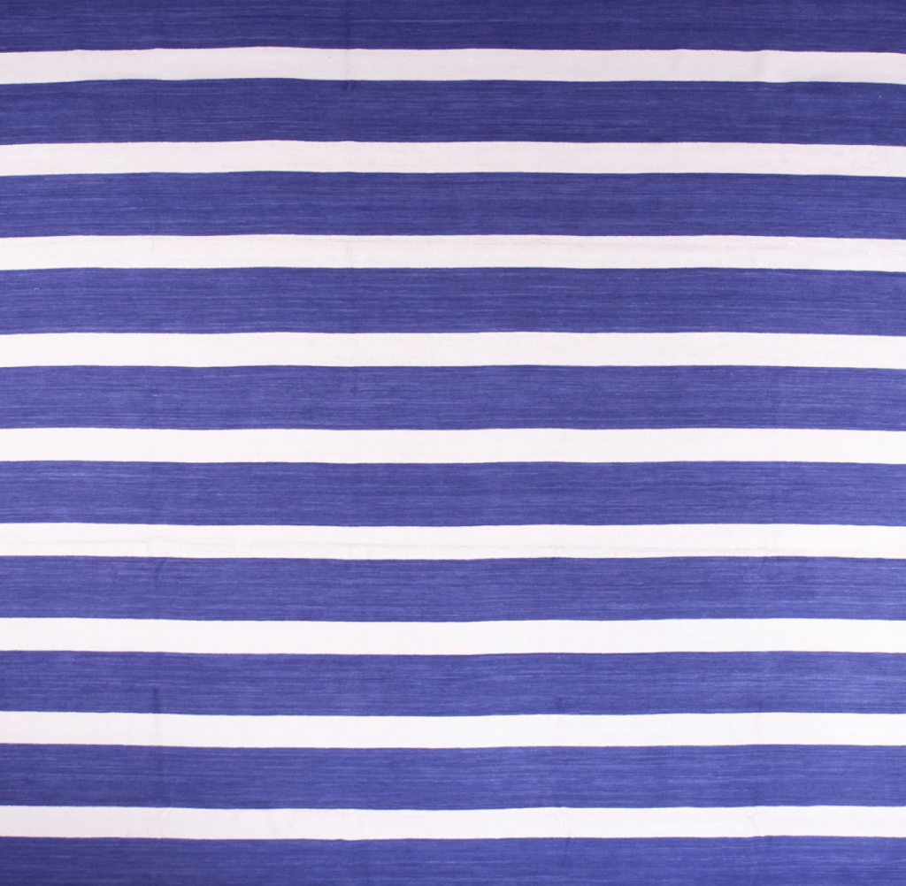
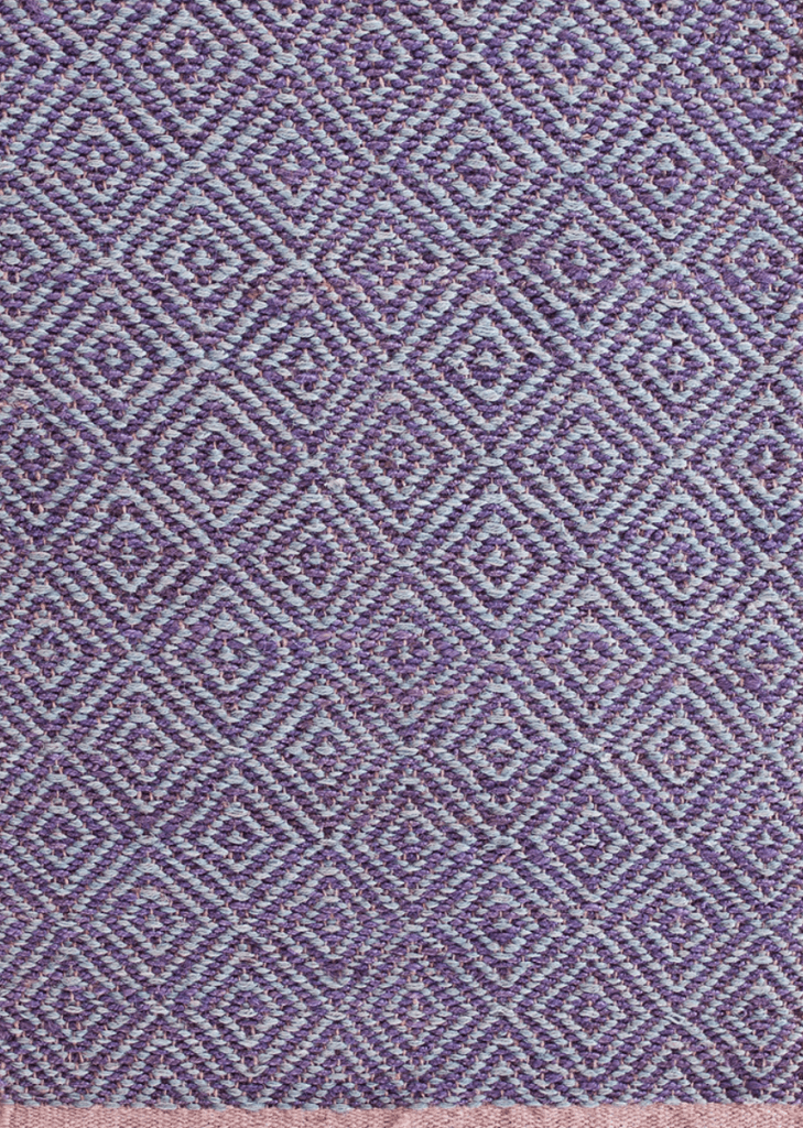
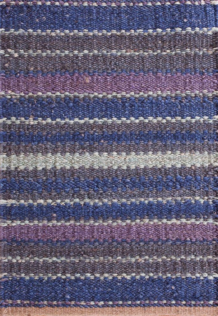
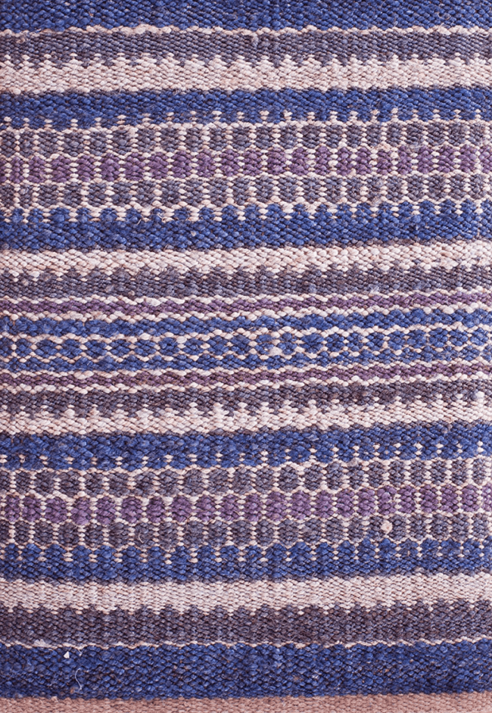
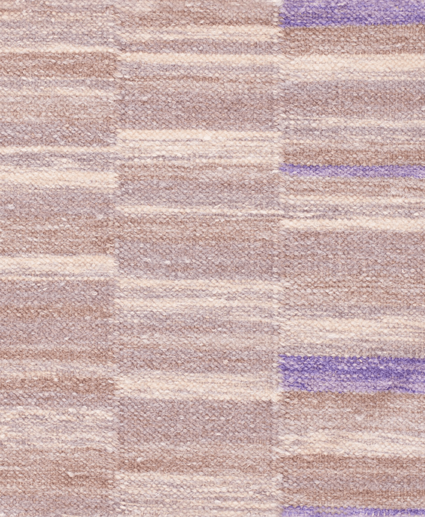
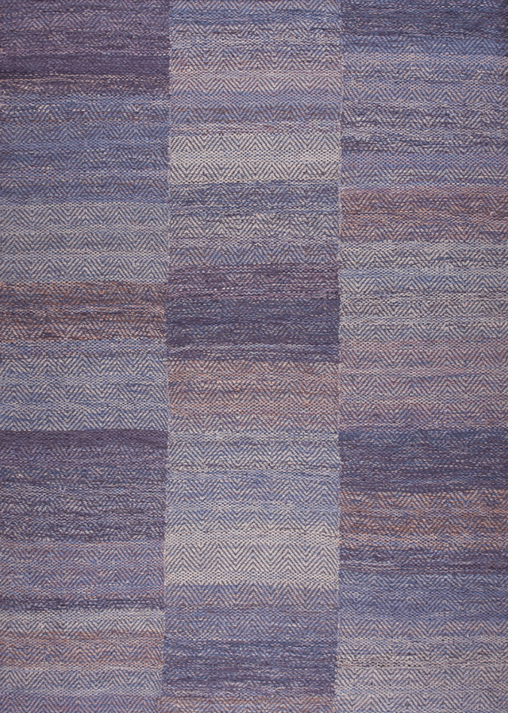
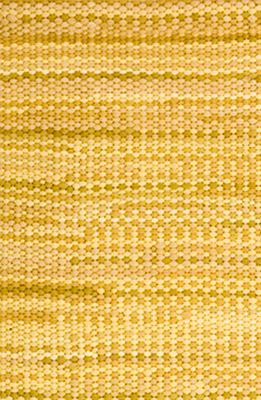
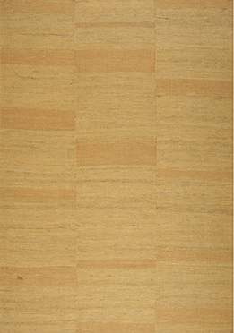
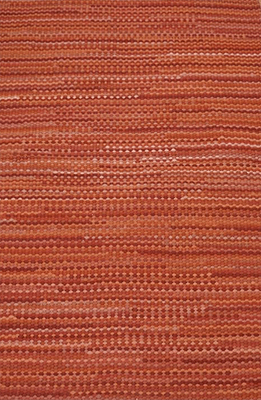
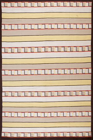
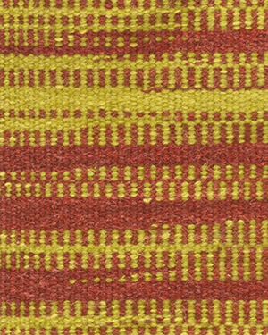
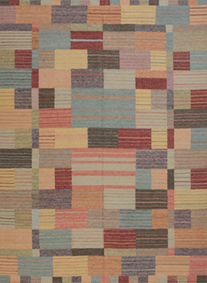
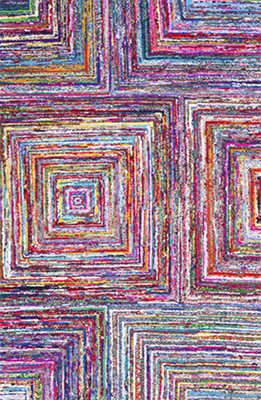
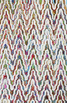
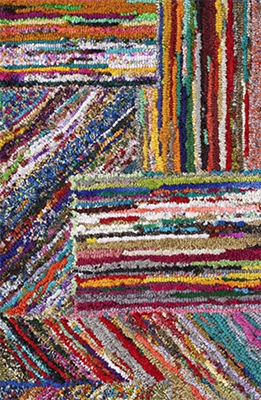
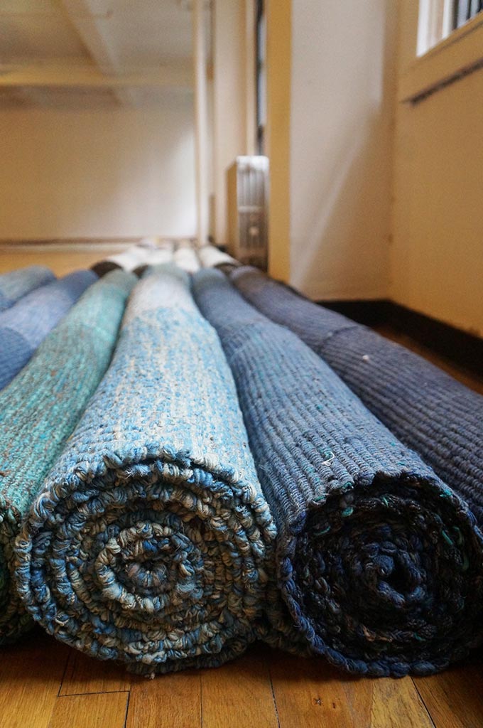
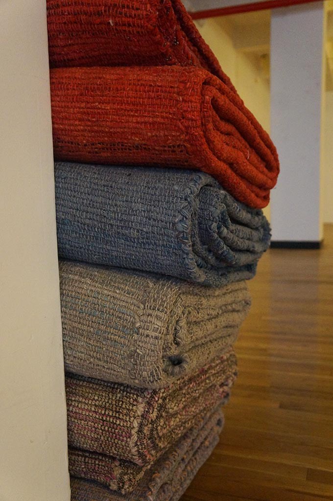
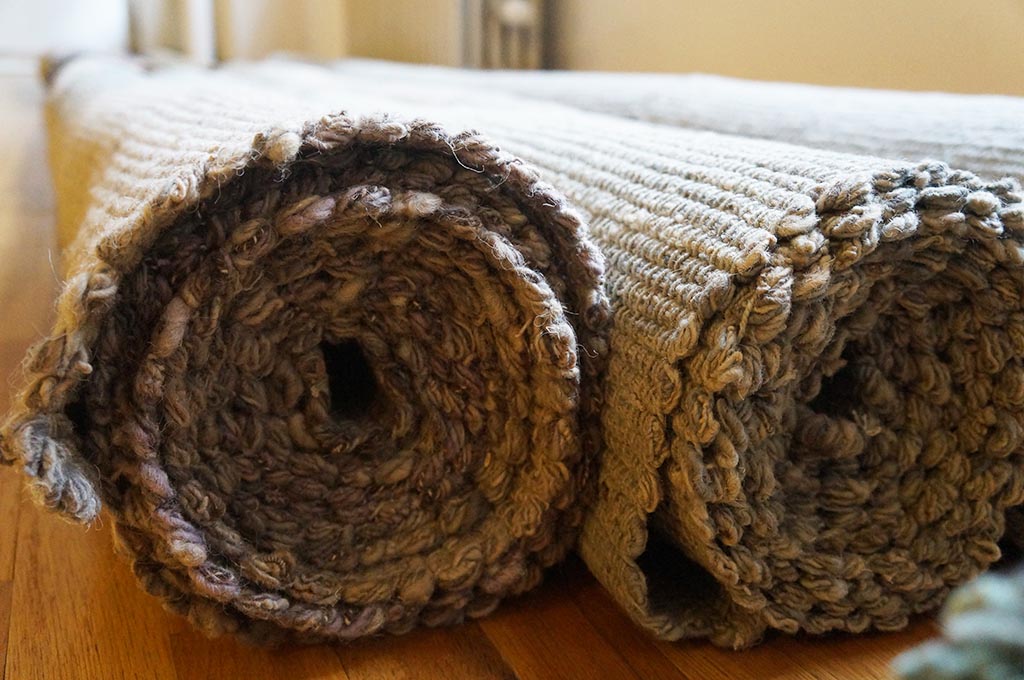
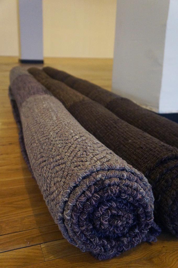
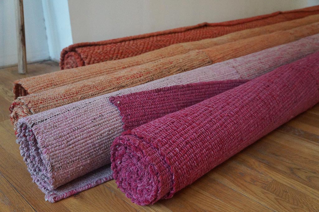
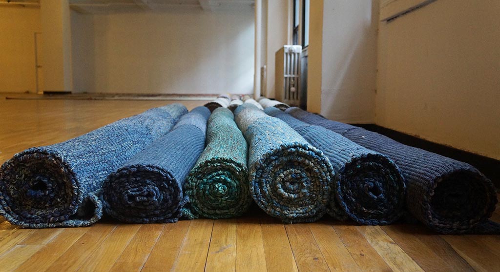
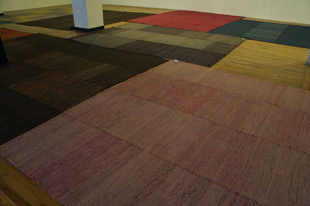
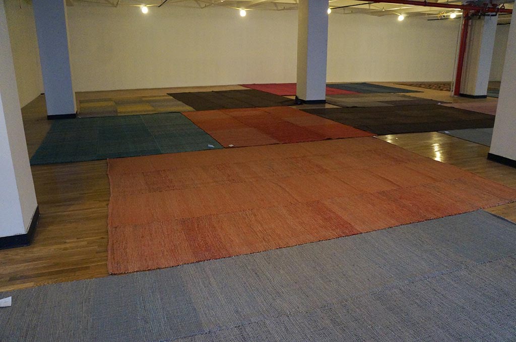
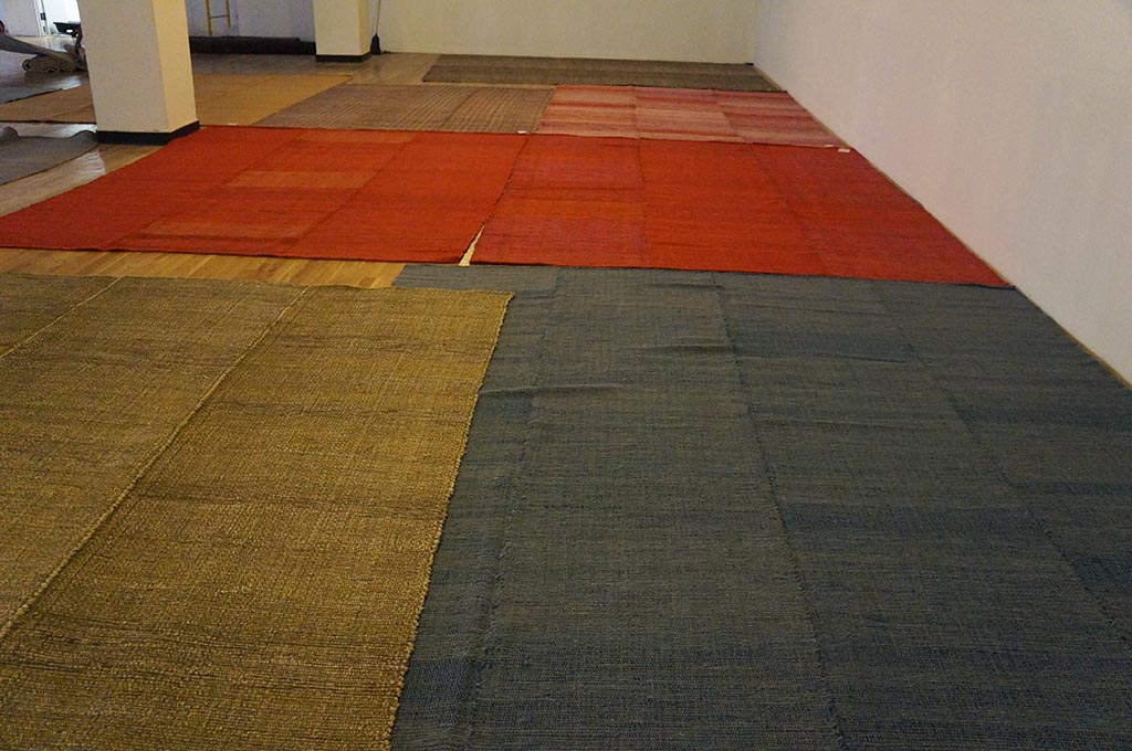
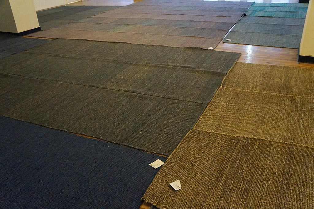
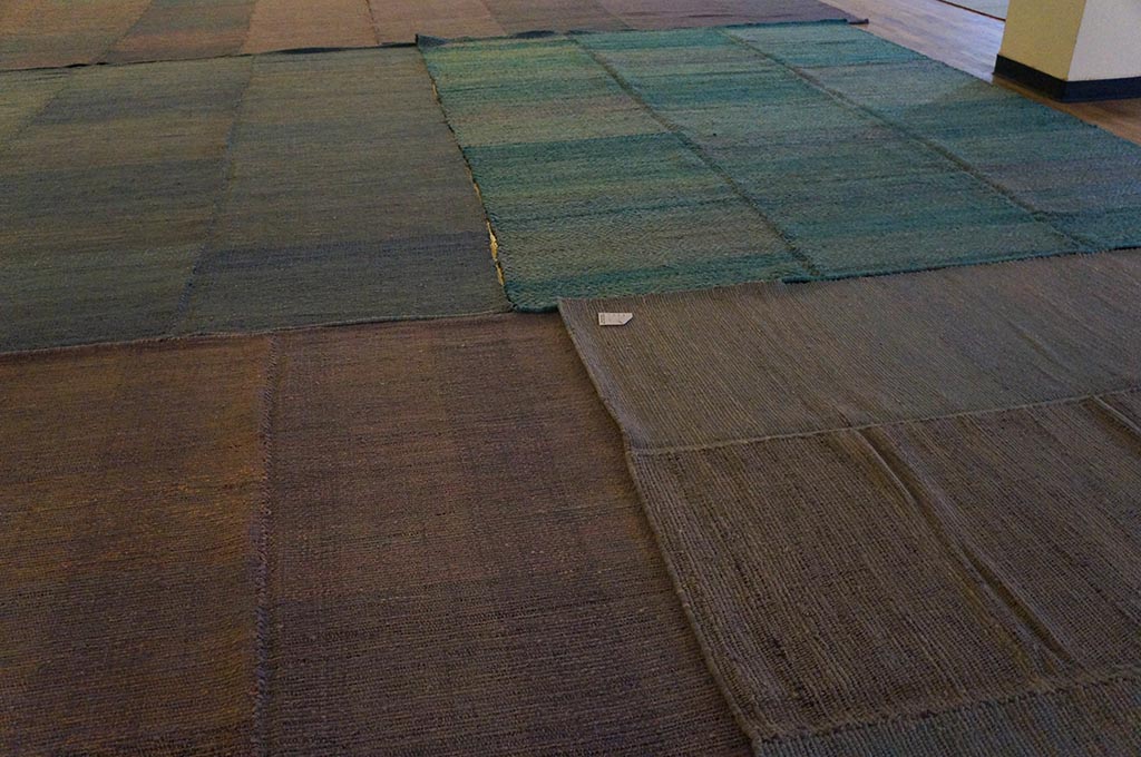
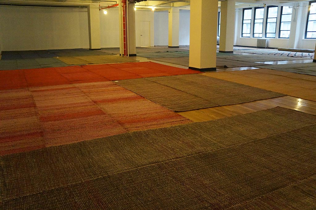
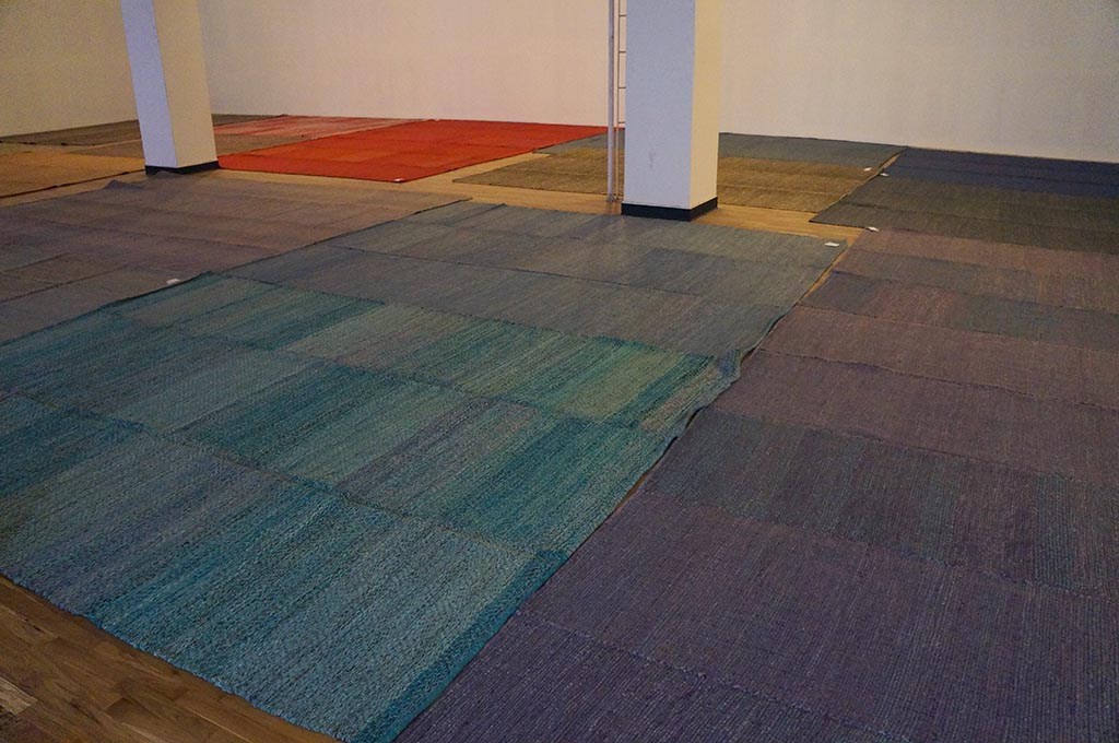
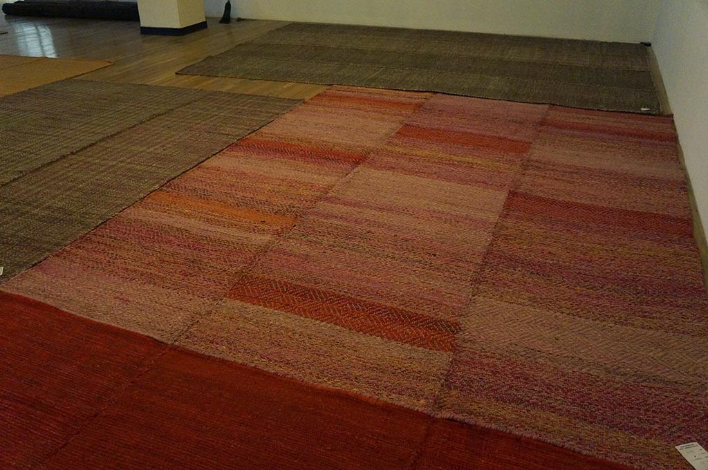
The Shaker Collection is a simple, and comfortable line of floor coverings, inspired by traditional American Rag Rugs. Durable and easy to work with, much of the charm of these pieces comes from the variation of color found within – as well as the memory of a space you may have known in your past.